

Professional background
Passionate about objectively great products and problems worth solving.
I’m currently the founder of Ascendable, making missions manifest, helping ambitious founders create the best possible products. I’m a product design leader 🚀 with 23 years hands-on commercial experience, working for businesses from micro-, right up to PLCs.
Most of my experience has been in Enterprise SaaS, but also with local and national brands such as The AA, Stella Artois, Tesco, Hotel Chocolat, etc. I have been in leadership roles for 9 years. Previously Head of Design & Research, EU Amazon Payment Products. Before that, Head of UX, and Head of Product, at a FTSE 250 business.
I’ve had a significant exposure to Data Science (incl. ML and AI) and I’m passionate about combining Qualitative (Human-centred Design, ISO 9241-210:2019) with Quantitative (statistical data science, ISO 20252:2019) research.
Elsewhere on the internet
Equiniti Plc
How might we make consumer data more personable?
AdvertisingBrandingBudgetingCompetitor AnalysisCopywritingDesignEthnographyGo-to-market strategyIdeationInformation ArchitectureInteraction DesignLeadershipMarket ResearchMarket StrategyMarketingProduct ManagementProduct StrategyPrototypingScrum MethodologyStakeholder ManagementStrategyTeam ManagementUI DesignUser interviewsUser ResearchUser storiesUX StrategyWireframingWorkflow ManagementWorkshopping
A number of details have been redacted, due to contractual agreements and sensitivities.
Background
As Marketer’s we aim to focus upon the simple things. Great Service, Great Products, Great experiences. These simple things transcend everything we do, and believe in. Yet the world we live in is getting more and more complex. In the face of complexity, it makes it difficult to allow the simple things to transcend.
In order to focus upon the simple things, we must maintain our connection with our audience. The way a sentence is phrased, the way marketing material is written, is all determined by who we are speaking to. After all, you wouldn’t speak to your friends in the same way you might speak to your nan, for example.
Understanding ‘who’ is the first step to answering ‘why’. Understanding ‘why’ allows us to cut-through complexity. Within it all, people are complex creatures. Ensuring our messages are personalised, and of true value to our customers is complex, but needn’t involve guesswork.
Proposition
Amplify was our answer to understanding people-plexity. It was a new cross-channel consumer classification system designed to help you understand people – from the demographics, geography, lifestyles, psychographics and buying behaviour [UK adult population].
Customer behaviour has evolved, and the marketing landscape requires a new map. In a world of decreasing customer loyalty, increased choice, multi-channel touchpoints, it’s essential that marketers have a tool which can supply a meaningful language to customer behaviour.
My role
My role transitioned throughout the project, such that my official title was Product Manager, and I became the Head of UX Design and Marketing towards the end of the project. My role was essentially to define what the product was, to investigate the central needs of the market, and to write user stories and milestones to get the business to deliver the product most successfully.
Discover
Having worked in the business for many years, it might have been expected that there was already deep knowledge of the data industry. And this was true to an extent. However, the data ‘market’ is broad, with an ever increasing range of applications and needs for data-driven solutions. Initially, I conducted a deep-dive into the sub-industry of Geodemography, and it’s application in commercialised data products.
Market research
Below is an example of a wider contextual study, with particular interest given to competitor products and to trends within the data industry to make use of these products. These trends and themes were then mapped to Everett Rogers’ Diffusion of Innovations bell-curve to establish how these trends might continue into the near future.
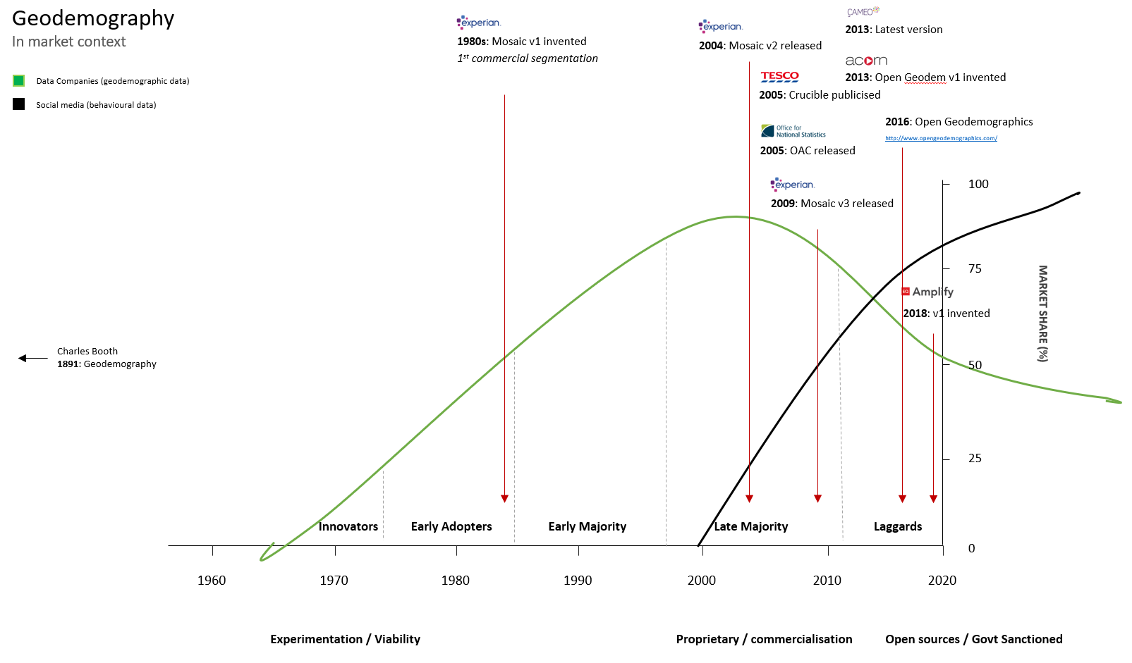
I also made a considered study of the regulatory pressures on the data industry, and how those might affect the success of a geodemographic product being released in 2018.
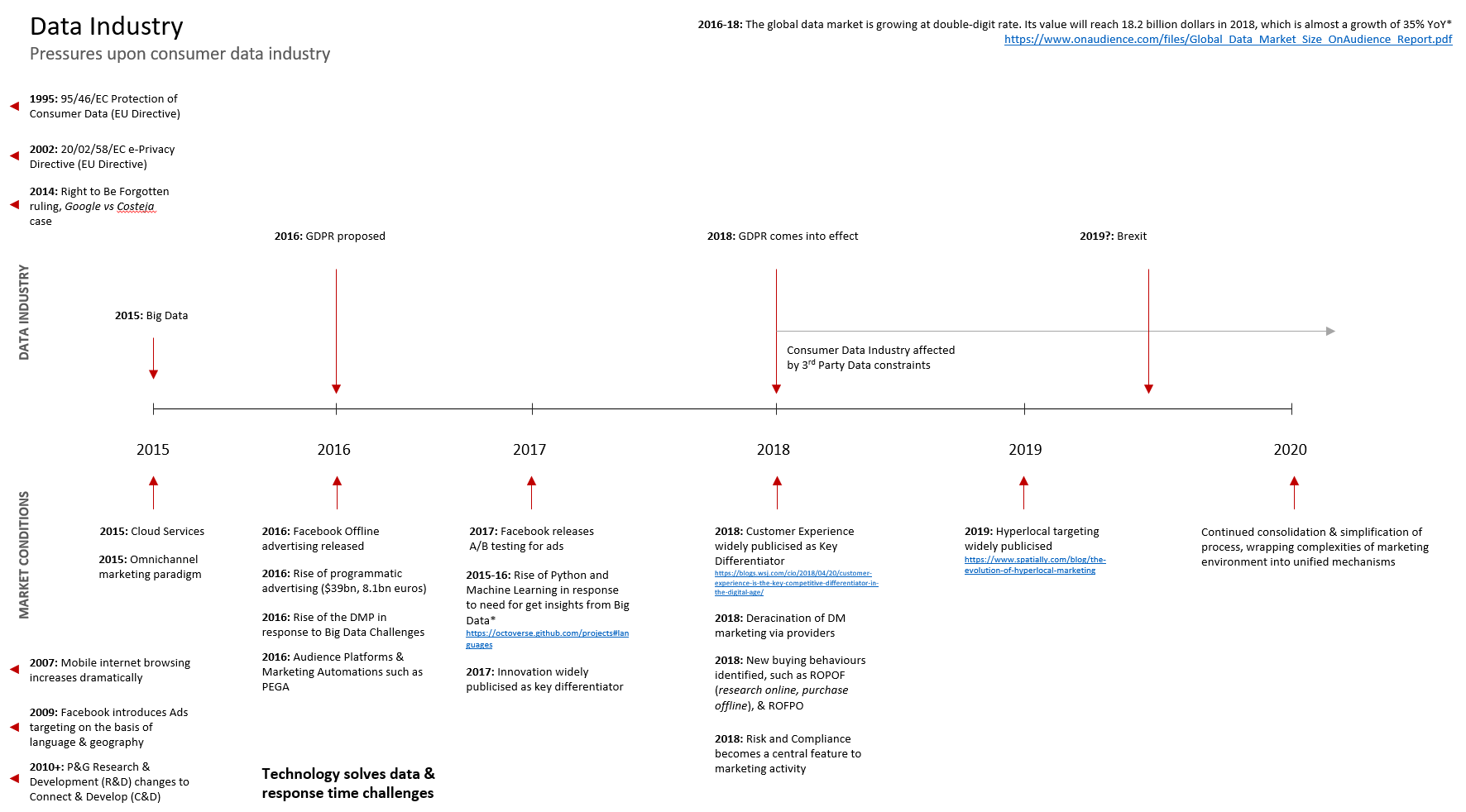
Both these studies affected and informed strategic decisions made throughout the project.
User Interviews
Using our existing partnerships and relationships, I was able to interview users of competitor products. I explored what they used them for, how they assisted with their work, and how they could conceive of a way to reach those outcomes more effectively. The learnings from these sessions were then reduced into a set of User Personae. These interviews took the form of 1) Direct interview, and 2) Safari, i.e. observational and situtational analysis of the user in their natural environment. Some intercept questioning also took place, to ensure that I understood patterned behaviours.
Competitor Analysis
Because the market for Geodemography was already fairly established, with some very strong players in the space, it was essential to understand each competitor and their products. I wrote a detailed paper on the strengths and weaknesses (SWOT) as well as how to exploit our own competencies at Equiniti to ensure our own offering was genuinely of practical advantage to our customers.

Develop
The User Experience was central to competing in a mature market.
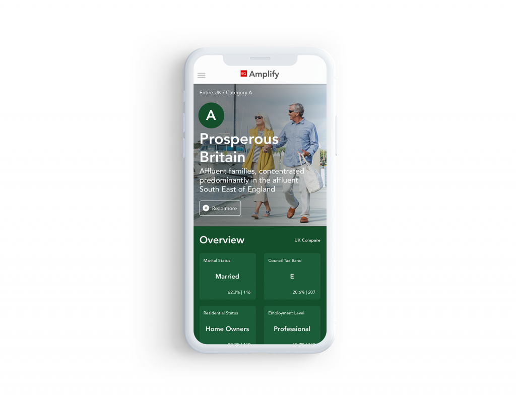
Central to our offering is how we make this information accessible. We have experienced competitor products over the years, and established how many of the products didn’t make the data useable. Accessibility was always a low factor on the agenda. We aimed to ensure that our product is not only user-friendly, accessible and useful (sticking to UX principles), but also desirable, and attractive. If you have to use a Consumer Classification product, why not use one which looks good and is a dream to use?
Good design means that you not only get richer insights, you get them quicker, and you get them without hassle. You can immediately get a ‘feel’ for a category without having to sit and digest, because we factored in System 1 thinking, as well as recognition rather than recall. Our human-centric product means that getting to know and understand your customers breaks down the traditional barriers of other consumer classificiation products.
You can get to experience this portal in two ways: you can request a demo, watch our example YouTube videos and walkthroughs, or take a look at our demo portal, which runs using sample data. If you want to get richer insights about our product and how it was built, then request a demo today.
With a wide variety of visuals and analytics, you can deep-dive right now into the age, income, and household composition, alongside channel preference, technology adoption – as well as present and share them with your senior stakeholders at the click of a button. Coordinating marketing activity around your target audience has never been easier.
Information Architecture
Using an output from the Data Team, I knew that there was a requirement to show around 6-8 categories, with a drill-down into 48 sub-segments underneath them. The sub-segments were children of the parent categories, and therefore it was necessary to allow for drill-down.
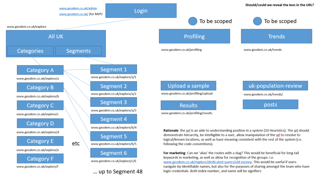
This was the initial information architecture which was used through the project to deliver the right content, as well as to demonstrate the relationships between each segment.
Initial prototyping
I iterated quickly through a number of prototypes, creating around 4 versions with sub-iterations. Each version was tested rapidly with users to assess whether the information architecture and the design conventions were appropriate for the target market. The prototype was built in Axure, and finally reached sufficient performance at version 4.3.
User testing
User testing was conducted using Intercept and Talk-aloud methodologies. Users who were involved in the initial consultations were asked to kindly return and provide feedback on the initial designs. To avoid the affects of Operant Conditioning, different versions were tested each time to avoid habituation and improvement in performance because of getting used to the design. We experimented with new features, and also alternative design patterns to see whether tasks could be achieved easier.
High-fidelity
As part of the project, I wrote why User Experience was a major differentiator for this project. As part of this content, I described the heuristics involved in the design, and how they improved the accessibility of the content for the user.
1:1 at scale, down-scaled – Multiple levels, from the entire UK, down to categorisations, into specific segments. The structure of the site has been developed based upon the concept of zoom-in-zoom-out, i.e. that the UK consumer base is hierarchical and structured in this way by its nature.
Visual distinction – We’ve drawn important features and distinctions to the surface, and made them visual. The entire interface is driven visually, using a concept of ‘word-displacement’. By allowing high-level filtering, you can see the differences between segments quicker and easier than ever before, using a concept called ‘disclosure’.
Empathy Personified – The purpose is to understand the people behind the data. We’ve curated thousands of images and iconography to effectively represent key distinctions between human groups, and provide guidance on how to interact with these consumer archetypes.
Relationships and Networks – We’ve mapped connections and sought to demonstrate them in the most accessible ways possible. Using interactive network diagramming, graphing and charting tools, the relationships
Deeper detail – The purpose is persona, and the aim is to amplify. By delving into the details behind the data, we’ve been able to enrich EQ Amplify with the important facts to drive your media spend.
Data-driven confidence – Remove the guesswork involved in some of the unknown areas of media-planning and marketing by exploiting the power of a full UK consumer database. You’ll have statistical evidence to support your campaigns, as well as deliver the insights to originate new ones.

Promotion (including Go-to-market)
As Head of UX Design and Marketing, I was also responsible for marketing this product. So from originating and directing the concept for the product, through to designing and writing user stories for it for Engineering, and protoyping to test the outcomes of this work, I later transitioned to apply my Marketing background to promote the product too.
I wrote the initial press releases to the market, as well as writing the Go-to-market strategy and Advertising Plan. As part of this plan, I also wrote a script for a Promotional video.
Promotional video script
Once I had written the Master copydeck for the promotional material for Amplify, I then set about adhering with the principles of our new Brand Pillars, to ensure that the medium of the content was the most accessible and digestible. I wrote an initial script, describing how a third-party customer database might be used to enhance micromoments.
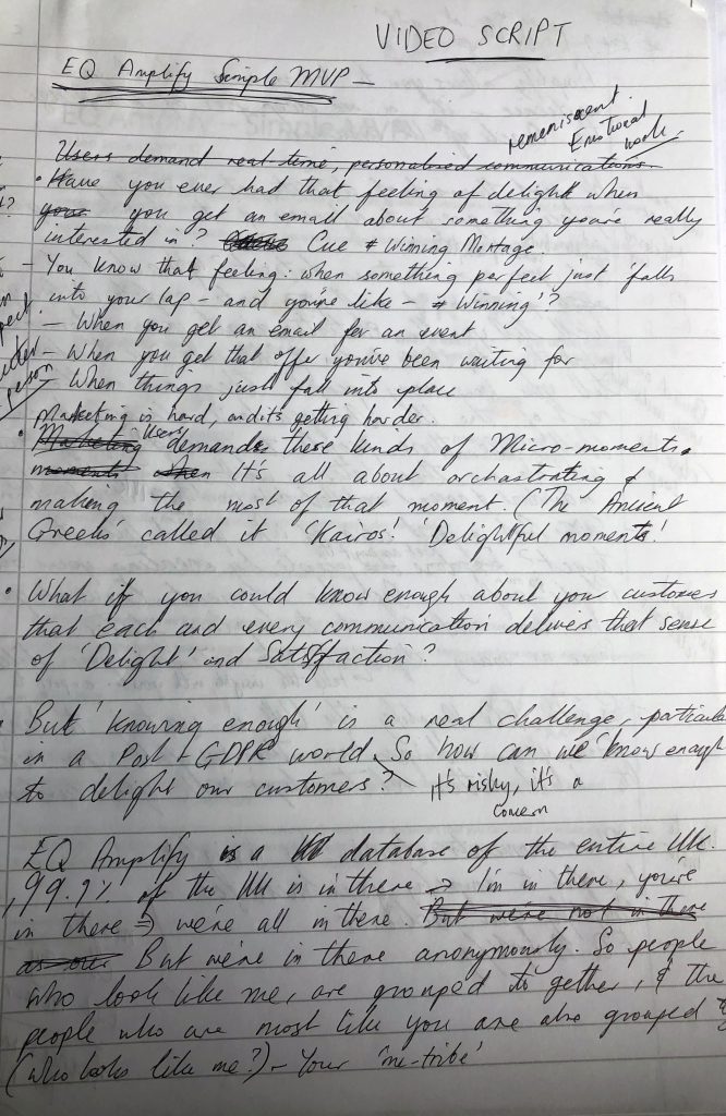
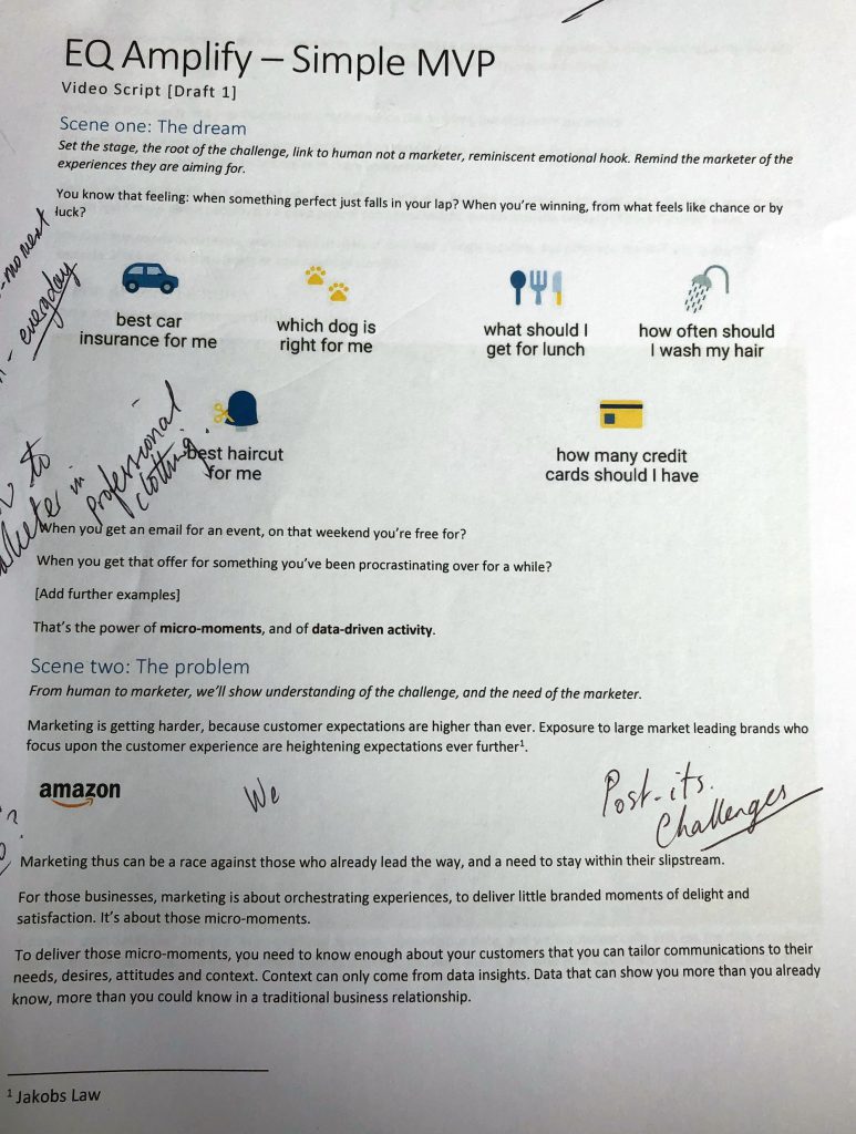
Here’s the final output, which was completed by a London-based video marketing agency, which you may watch here:
Reflections and learnings
This project was very rewarding for me, and the process taught me how to effectively design and deliver a modern SaaS Data product. When the product was completed, there was a fantastic sense of achievement, and I was able to circulate the summary and congratulations across the business.
A number of ideas were proposed and were not used in the end. These included Profiling, or ‘Bring Your Own People’ (BYOP), Category comparisons, Deep search, Dynamic segmenting and Persuasion Affinities. These are ideas which may be delivered at some point in the future.
See the live website
The platform itself can only be viewed using login details.