Background
Shortly after I assumed the role of Head of UX Design and Marketing, I set about establishing a new visual identity to suite the new brand narrative which I’d written. This brand narrative intended to put more focus on the use of data to drive customer-centricity in large corporate enterprises. We needed a single story which combined all our competencies as a business into one logical framework. We needed to assert our relevance to the market, give us the freedom to cross- and up-sell to grow existing accounts, one which described who we are, and where we intended to go.
The result was a brand narrative focussed upon Data-driven customer centricity, alongside a concept of ‘consumer science’.
This brand narrative unlocked a number of things:
- Aligned with corporate mission statements: Almost all the mission statements of our existing and desired clients explicityly were customer-centred
- Cross-sell other parts of the business: The story explained how each of the competencies of the business complimented eachother, and therefore were easier to reconcile and introduce to clients
- Authority of science: Because we’re driven by the need to understand consumers, all our activities are oriented around the best ways to gain and use wisdom
- Potential opportunity to pioneer ‘Consumer Science’: At this time, there were few competitors making use of this concept, and I therefore recognised it as an opportunity for differentiation
Getting the message was crucial, largely because, as Steve Jobs once explained:
Marketing is about values. It’s a complicated and noisy world, and we’re not going to get a chance to get people to remember much about us. No company is. So we have to be really clear about what we want them to know about us.
This was one of the driving quotations for the project, as well as the quote from Blaise Pascal:
If I Had More Time, I Would Have Written a Shorter Letter
For this reason, the overriding dictum for the project was how we could ‘make more simple‘.
My role
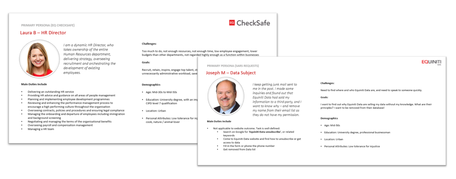
As both the Head of UX Design and Marketing, I was involved in briefing the design team to work on this project, defining the brand pillars and the context for the project. I had already done a significant amount of research to define Buyer Personas, and Competitor Analysis as part of my Marketing Strategy. As a team, we worked through a number of workshops, in which I acted as facilitator.
Process
We ran an initial design sprint, in which we focussed upon building empathy for our buyer personas. I had interviewed a number of clients, and so we worked through the learnings from those sessions, which occurred prior to my appointment as the Head of the Design team.
Empathy
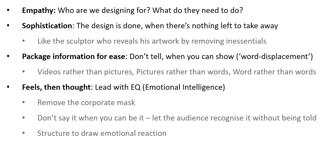
Based upon our empathy sessions, we also discussed the core principles of our approach. The outcome consolidated the views of the team, as well as extending our sessions to learn about other members of the business. The Brand identity was intended to represent the people of the business, and therefore express its unique personality as an outgrowth of the people creating value.
Discover
At the same time, we also followed another important concept. We recognised that we’re not the only one’s to solve the problem, and that most great solutions come from cross-pollination of ideas, and the Medici Effect, such that
All design is redesign
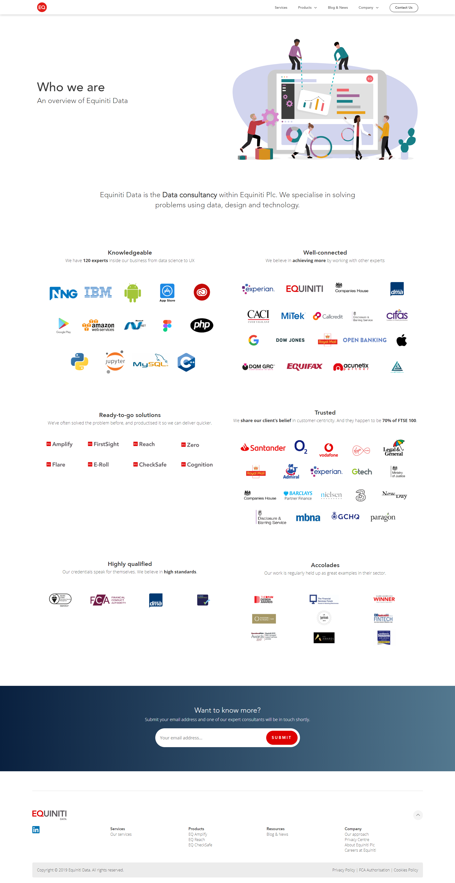
One of the Design team members did a profile of all the visual identities of the leading businesses within the sector. We surrounded ourselves in the best examples of branding the sector could offer, as well as the best branded businesses in a wide range of other sectors.
Define
Once we had examples of the best brands we could find, a keen understanding of our users, and a thorough appreciation of the defining aspects of the business – we were ready to consolidate into concepts we could reference throughout the project:
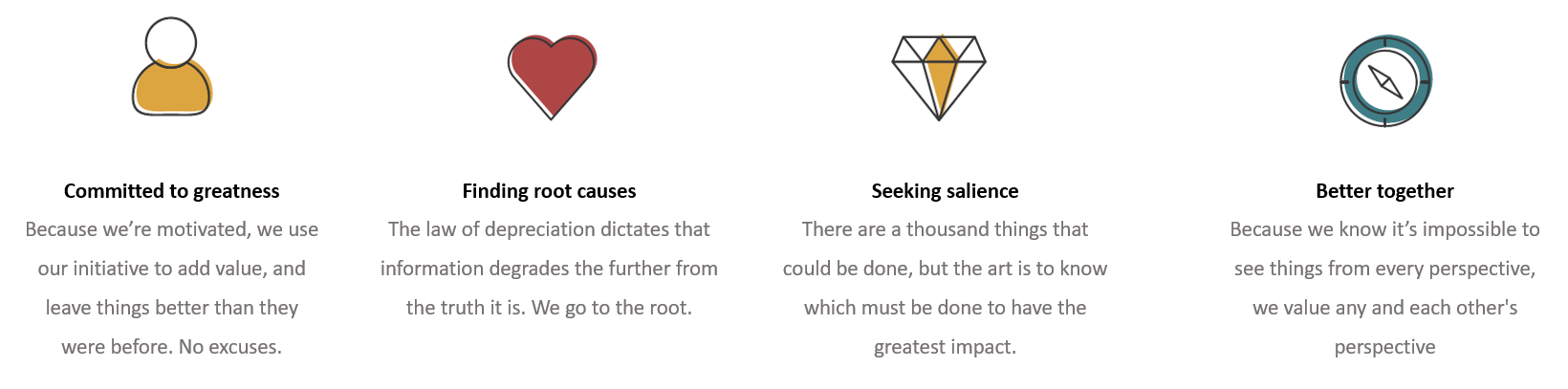
 As well as the values for our brand:
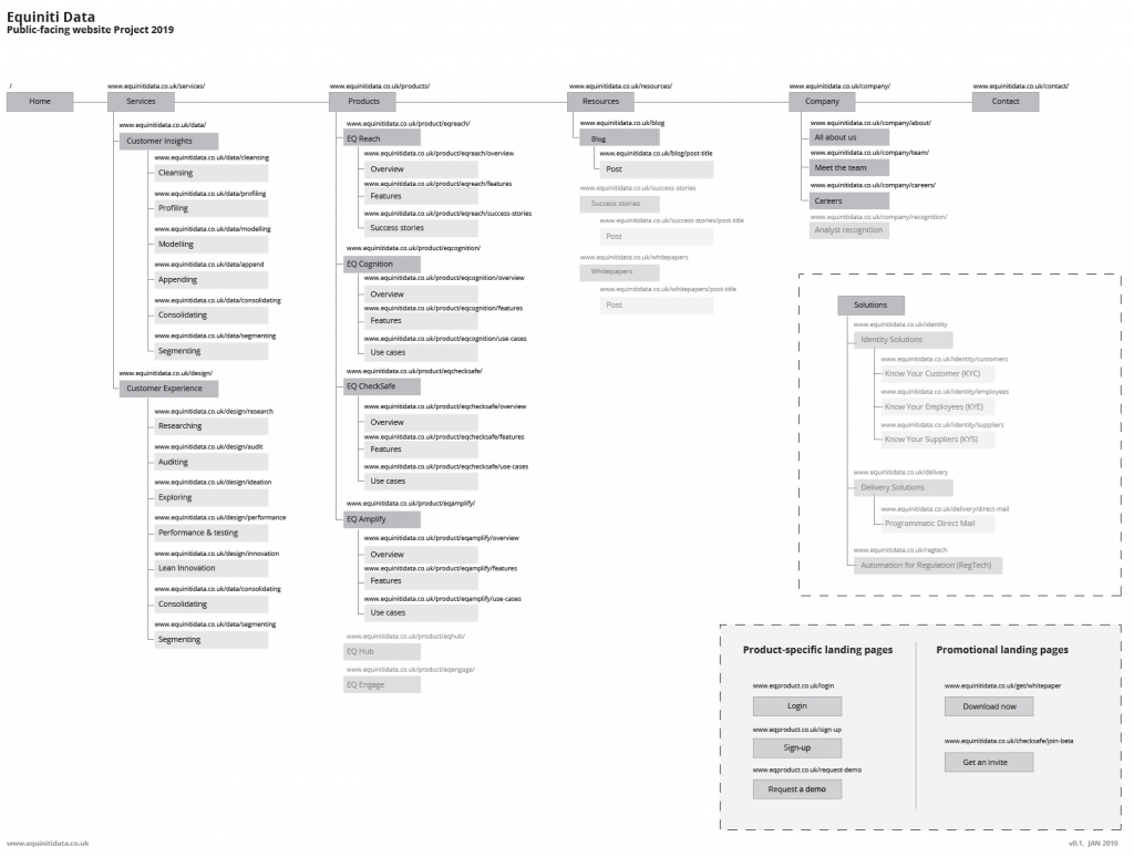
We also defined the primary outcomes for users, and established their most direct paths. This was the basis for an information architecture which I provided to the project.
Using these as guidence, we proceeded to Develop our ideas.
Develop
The team split into groups to work on origination and conceptualisation. We practiced the concept of Parallel Design. We then reconvened to workshop the results and practiced ‘dotmocracy‘ as a team to refine the decisions being made. In each refinement, we asked how could we ‘make more simple’?
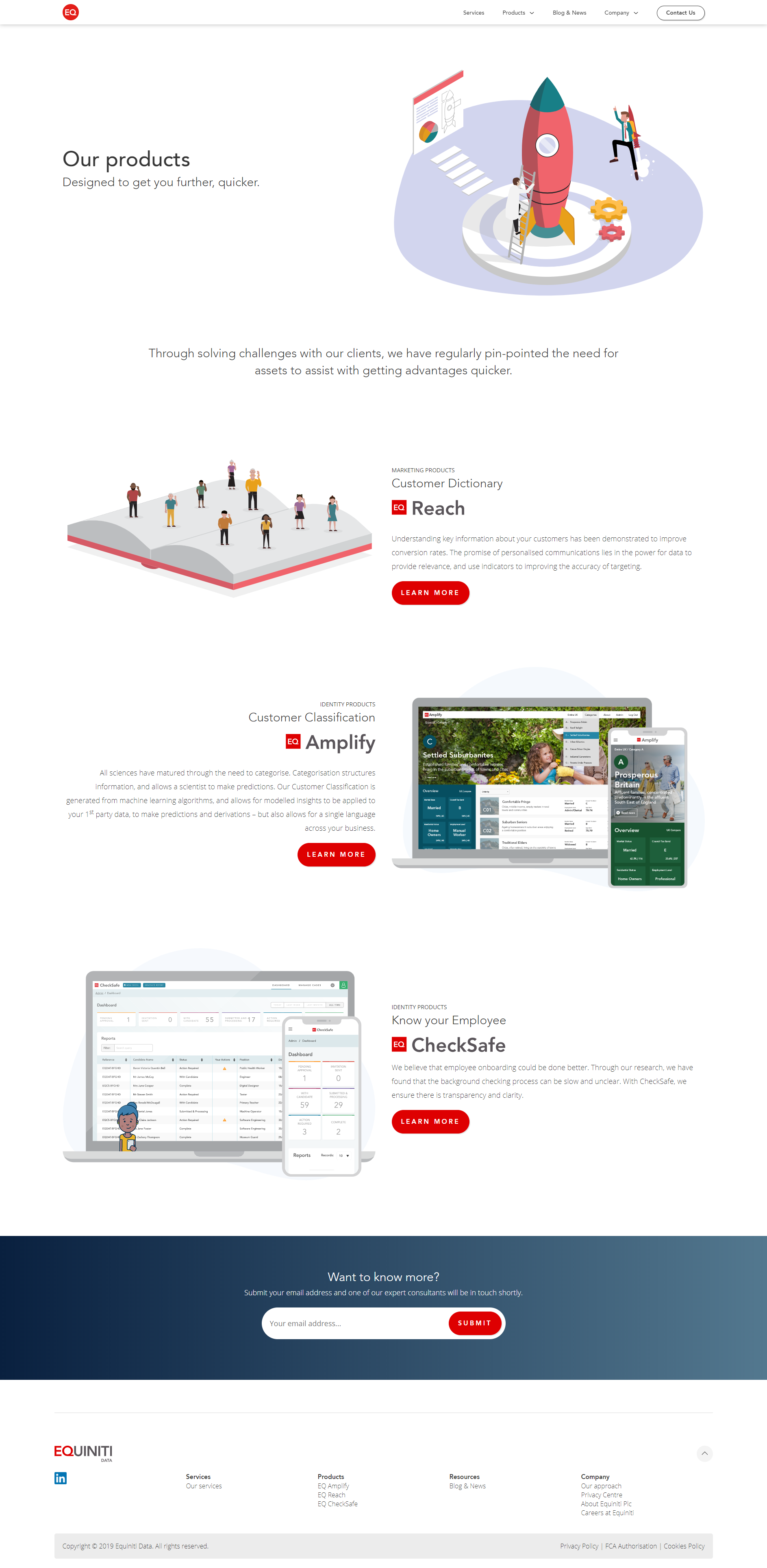
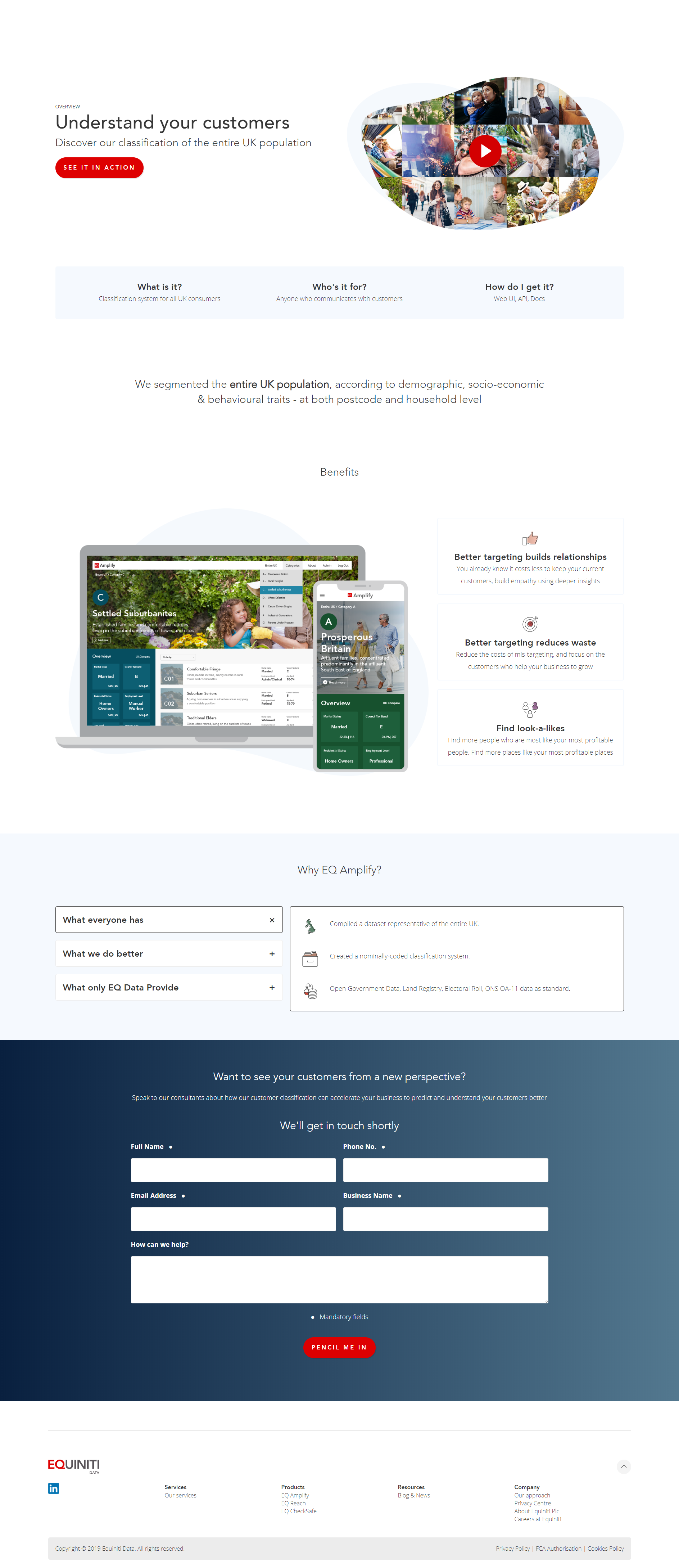
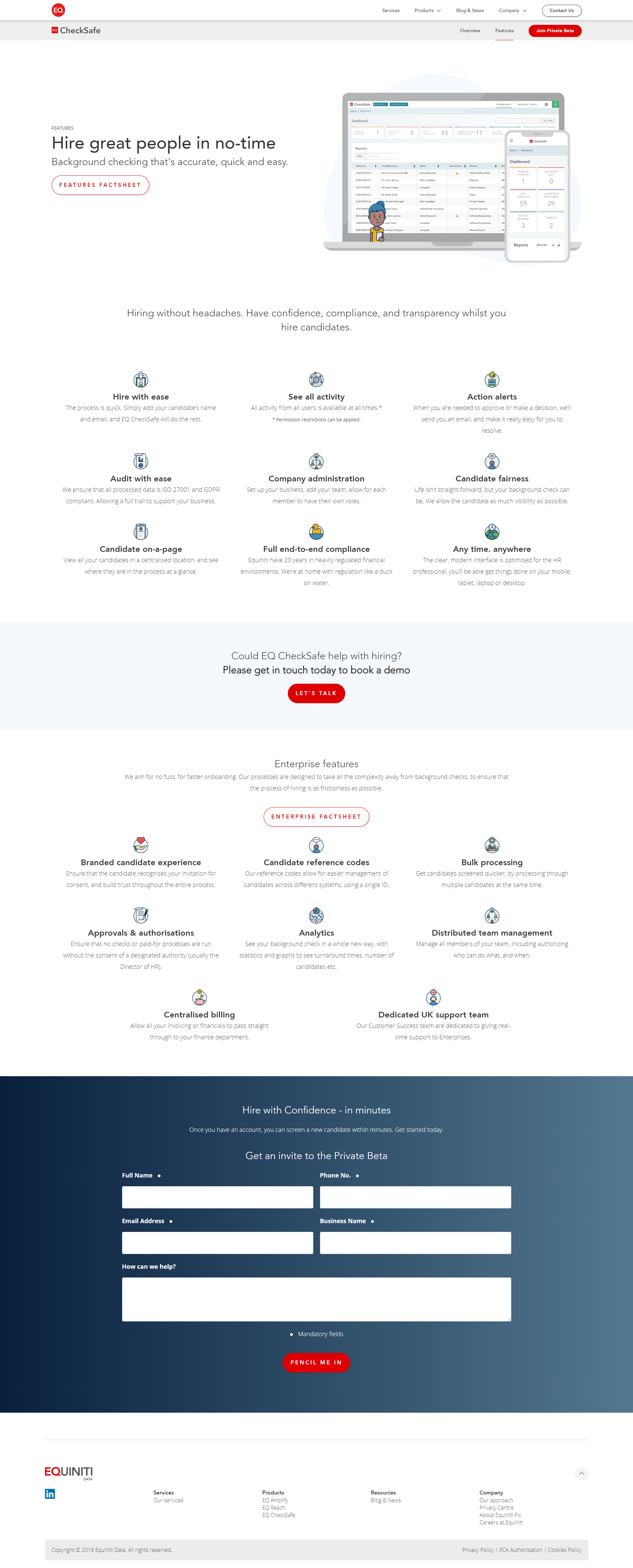
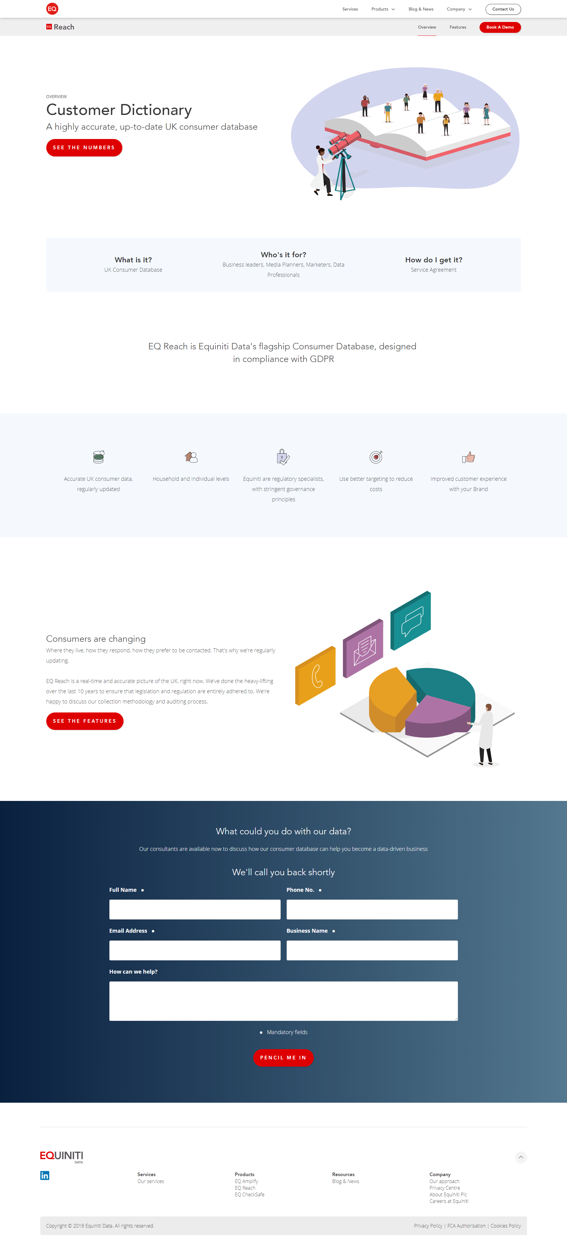
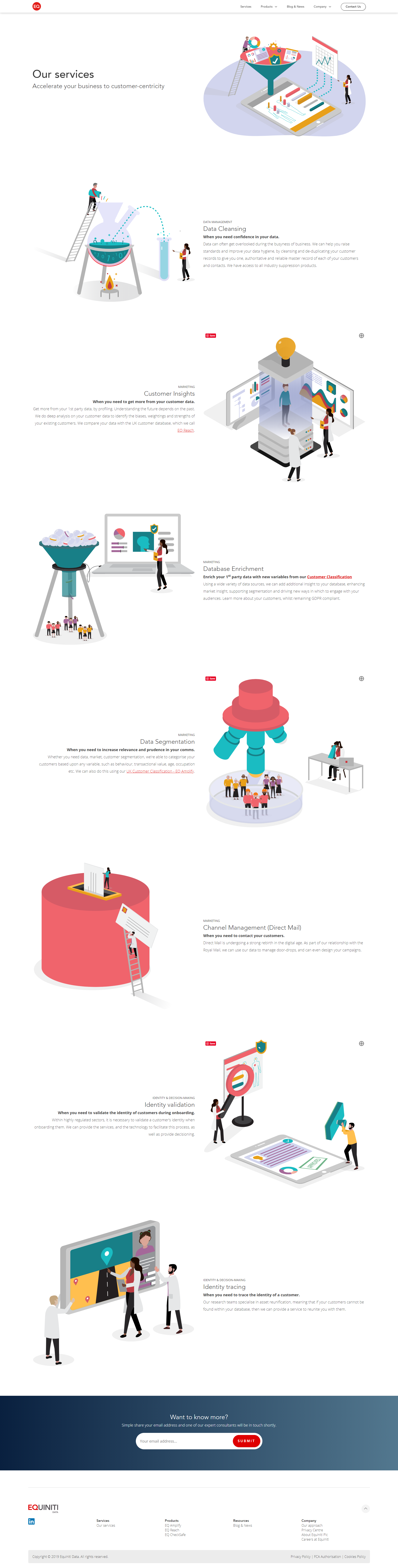
The first step was wireframing on the basis of the decision-making process. For example, the layout of the pages was designed to hold a story-arc, and to tie up the call-to-action with the primary headline of the page. I was also keen to ensure that we showed rather than told – to therefore we put significant focus upon UI patterns which facilitated showing rather than telling.
At the same time, I iterated through a Content Design process. This process wrote all the copy on the website, and iterated through it on the basis of people to the same people I had interviewed, as well as coordinating conversations with internal stakeholders.
Information Architecture
Final Designs
The final designs summarised everything from the project’s process.
The result was a look-and-feel which aligned with the illustrative route of tech giants such as Google, Microsoft, and Slack. In each illustration, we played with micro-and-macro – attempting to demonstrate clear juxtaposition in each one. We also ensured that almost all illustrations used a ‘scientist’ in a white coat, in order to identify clearly as a scientific approach – in alignment with the concept of being ‘consumer scientists’.