Solution (UI Design)
Upfront, I immediately listed the deliverables which would be needed for the game. Some of the assets I listed at the time were:
- Game Space assets: Arena/Race-track/Mountain etc
- Success assets: positive reinforcement, contextualised against the narrative (i.e. Completion of module: checked flag if a race, flag on summit if mountain; completion of achievements: rosettes, points, ticks, stars etc, also contextualised, such as ‘Sherpa badge’).
- Customer assets: Characterised customers, represented using graphical treatments (i.e. an image for ‘Mrs Penelope Smith’, an image for ‘Mr Joe Bloggs’ etc. A complete list of ‘dummy’ customers will need to be produced, so that a set of %%customer%% variables may be included within the system. We also anticipate the creation of derived characters, so that participants in the game will need to be judicious about their selection of the right one (for example, 3x John Smiths, but only one lives at ’72 Maple Drive’ etc). We shall produce an initial list, which can be agreed, then characterisations will be artworked.
- Leaderboards and Dashboards
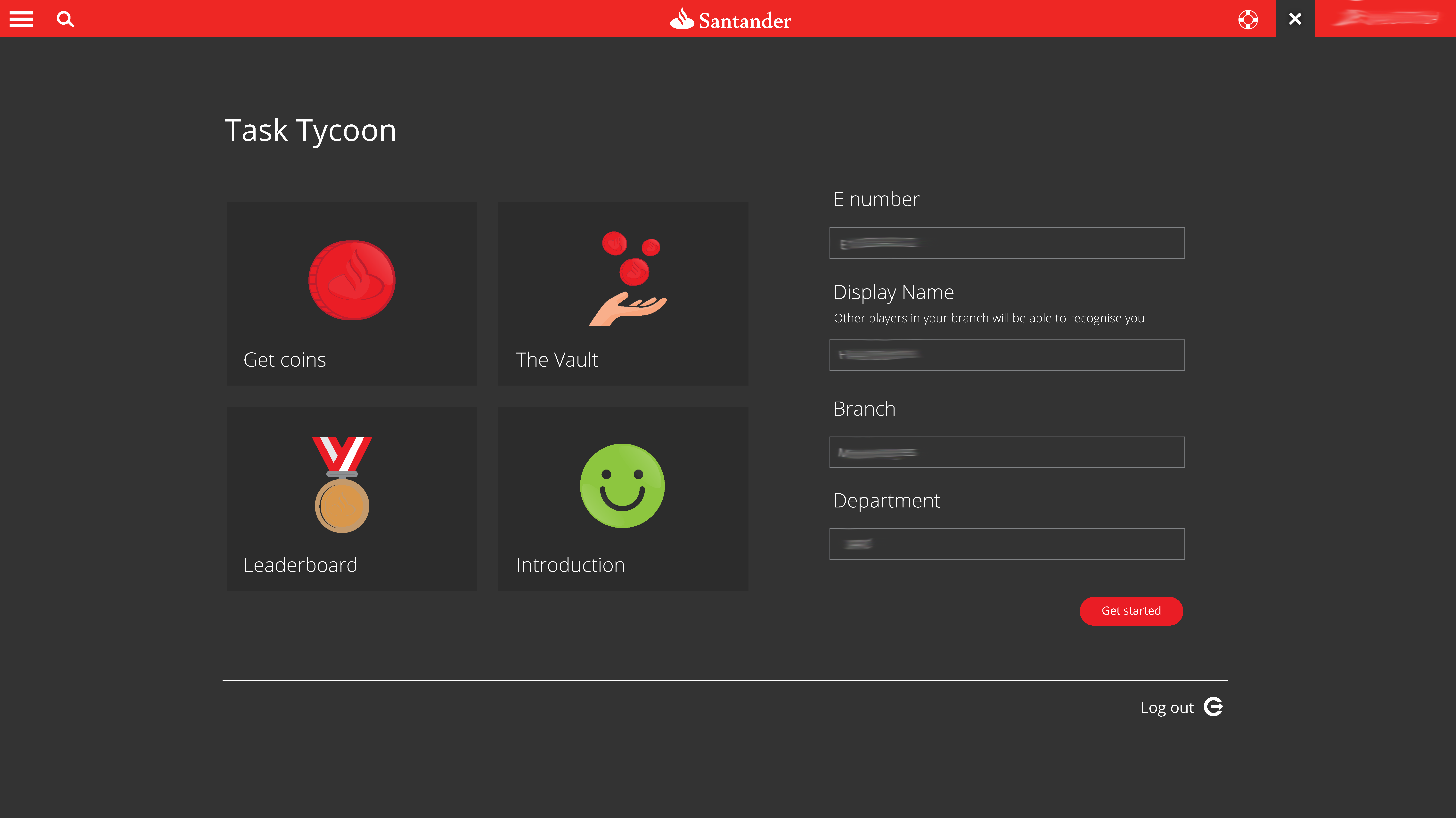
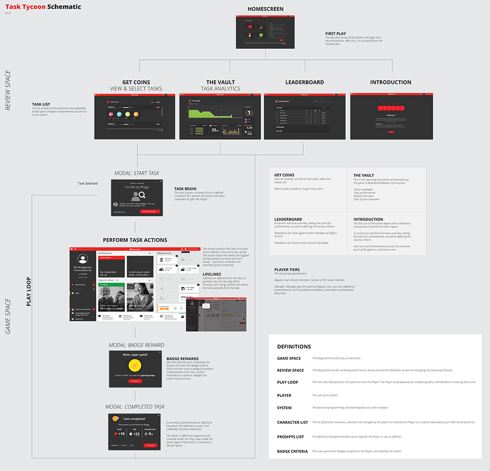
Welcome to Task Tycoon
The welcome screen was designed in order to explain the process, and also to set the tone for the experience. It was intentionally designed to look ‘fun’, and supportive of a sense of play and freedom. The CRM system was accessible as a ‘demo’ mode, and when the player/user wanted to play the game, they could access the rosette icon in the navigation bar at the top right of the screen.

Login to play
From the welcome screen, the user is then asked to login. This data collection process allowed the system to report on their useage, performance and which departments and branches were the highest performing.
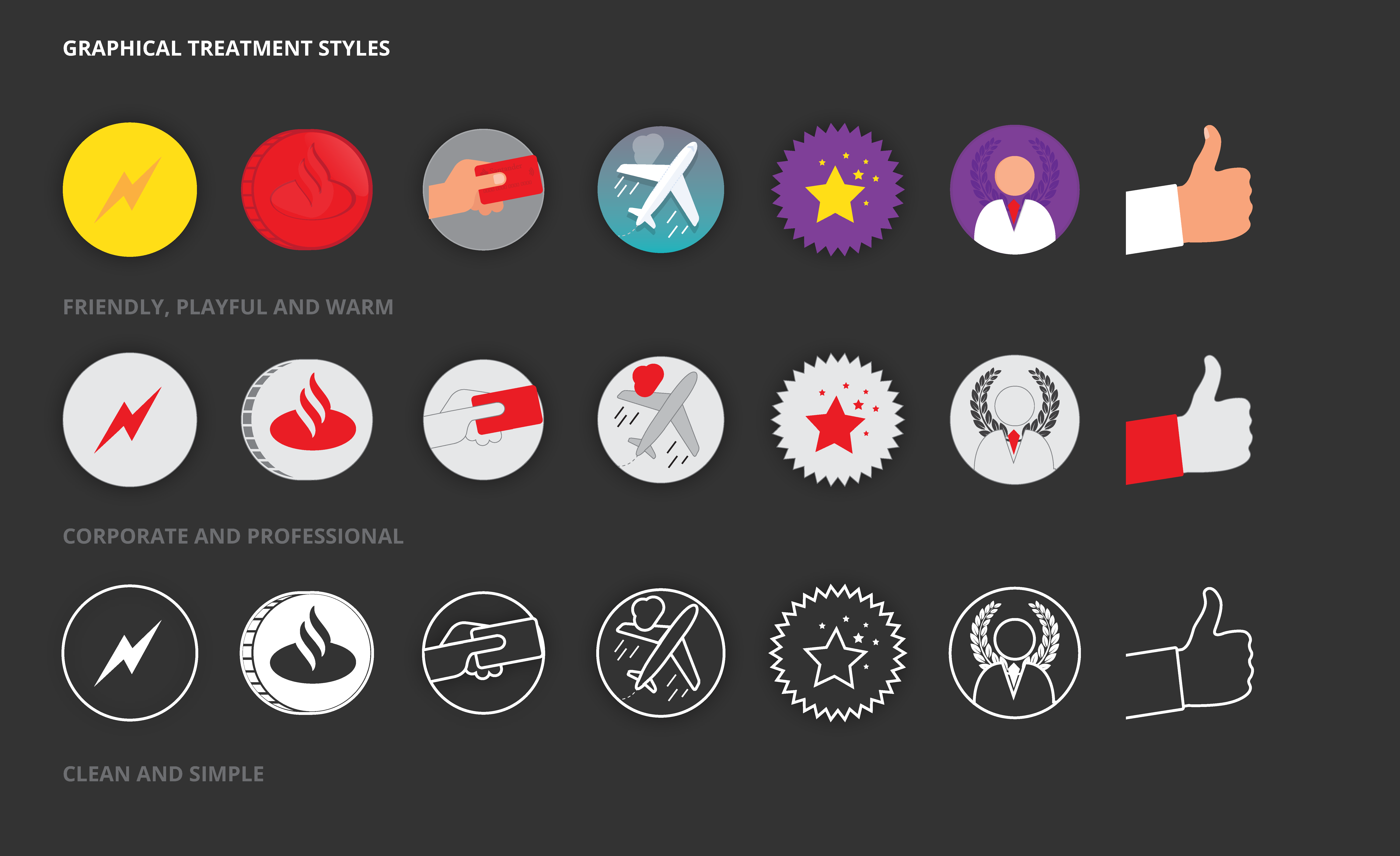
There were 4 options, each one with it’s own bespoke iconography which was based upon Santander’s icon set, but designed to be playful and more tangible.
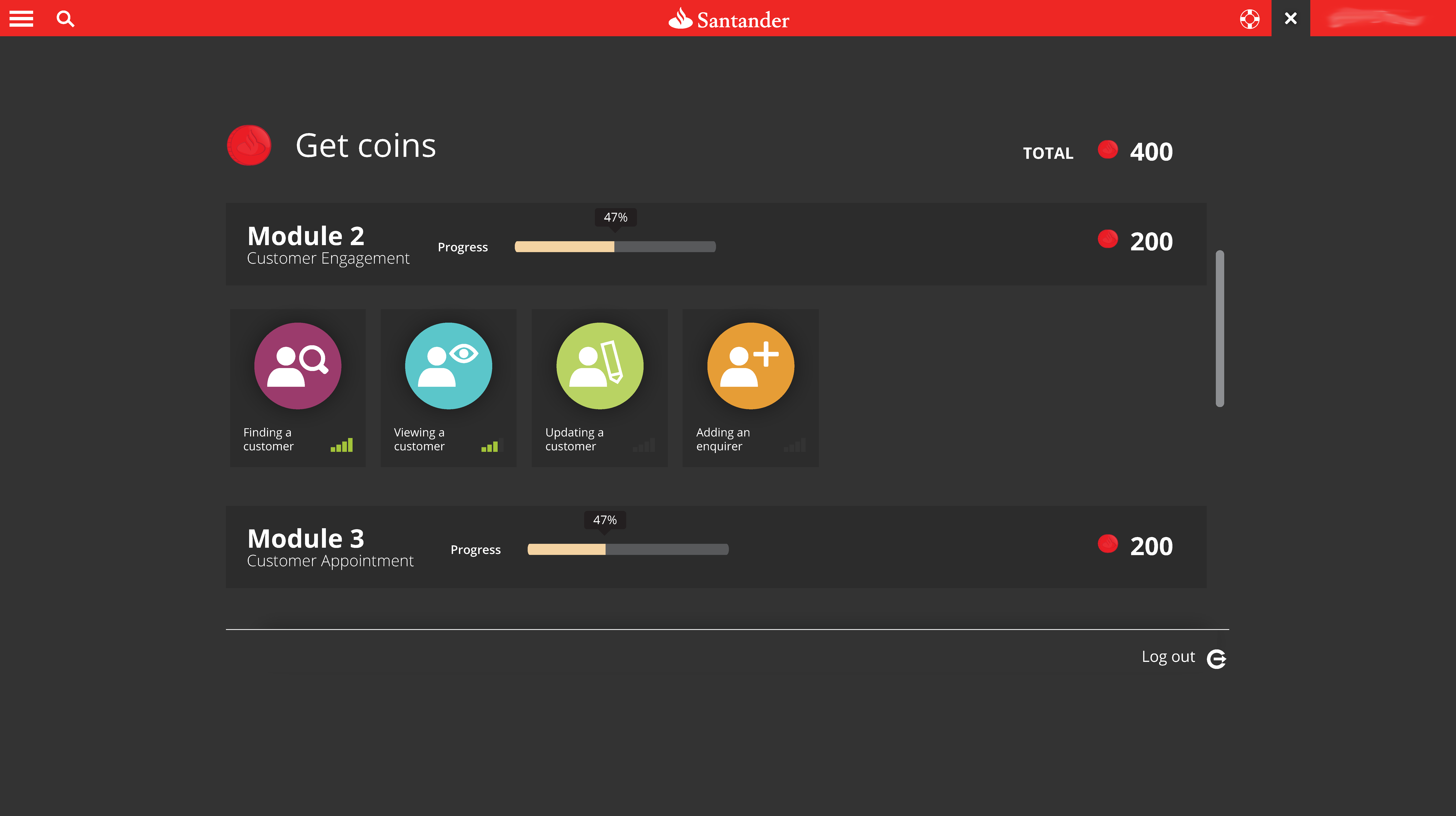
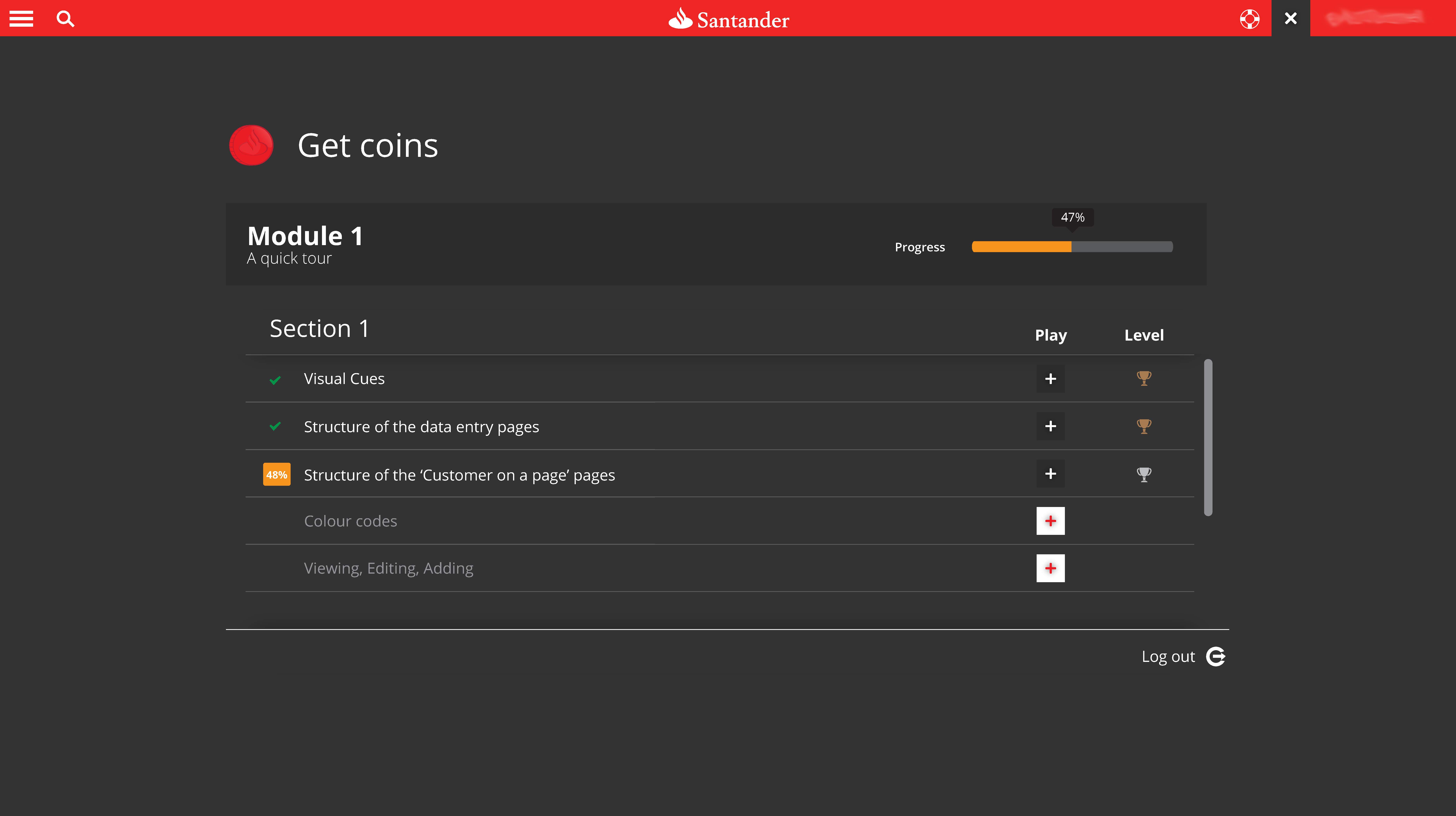
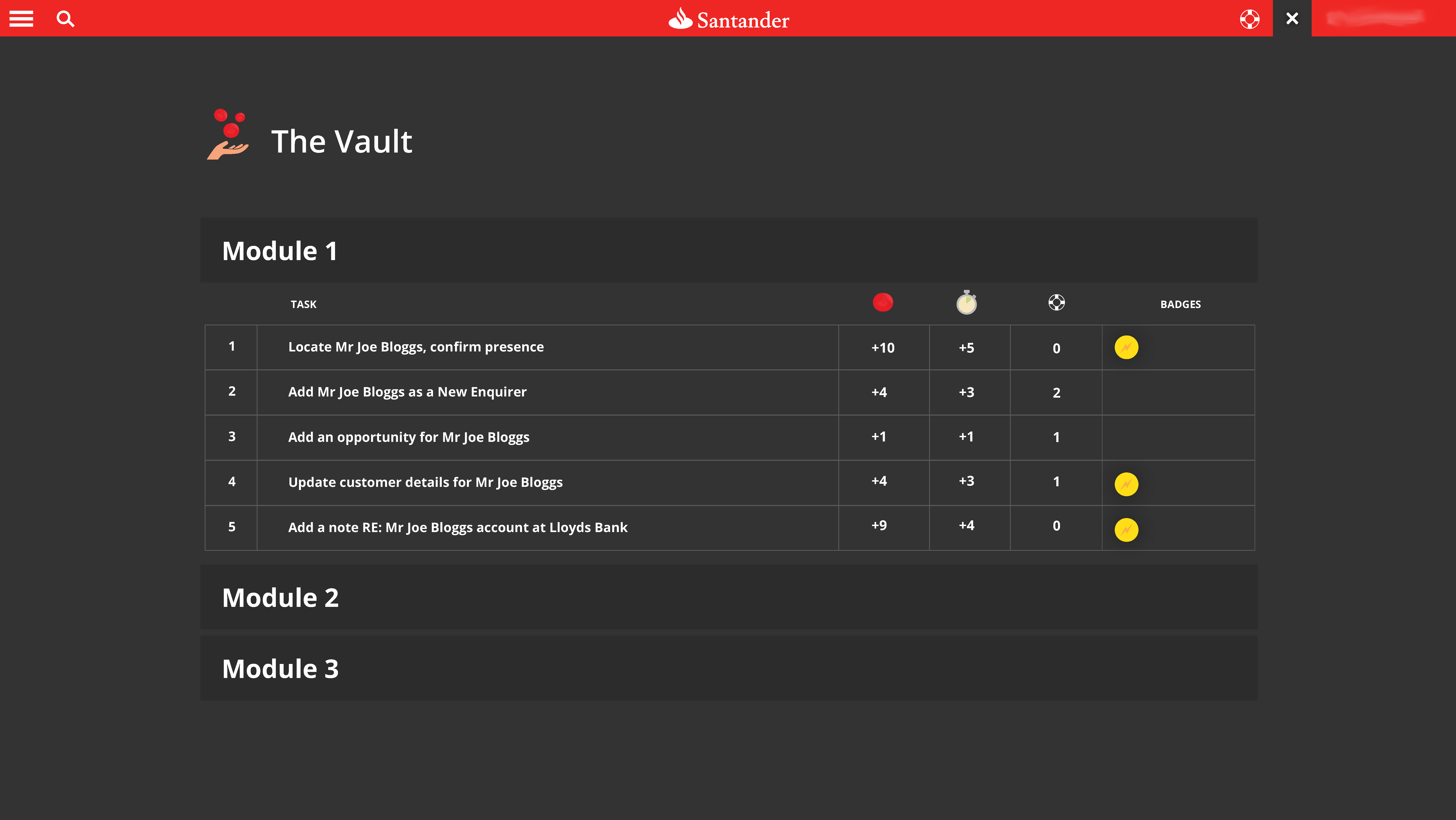
Get coins: Progress tracking
The main dashboard needed to show the user how many modules there were, and how many they had achieved so far. An achievement of a task allowed for the user to be given Coins. The coins were the users’ defined means of measuring success.
I designed 2 screens for this.
The first was an iconographic option, which also made use of cards within accordions. This route made the tasks feel more tangible, and each step more of an achievement than simply ticking off a line of text.
The second option was lines of text, but with positive reinforcement (the status was shown on the left-hand side of the label). New tasks could only be unlocked after playing the earlier tasks. These locked tasks followed a ‘disabled’ pattern, and also made use of a padlock symbol. Hovering over the padlock explained how to unlock that task.
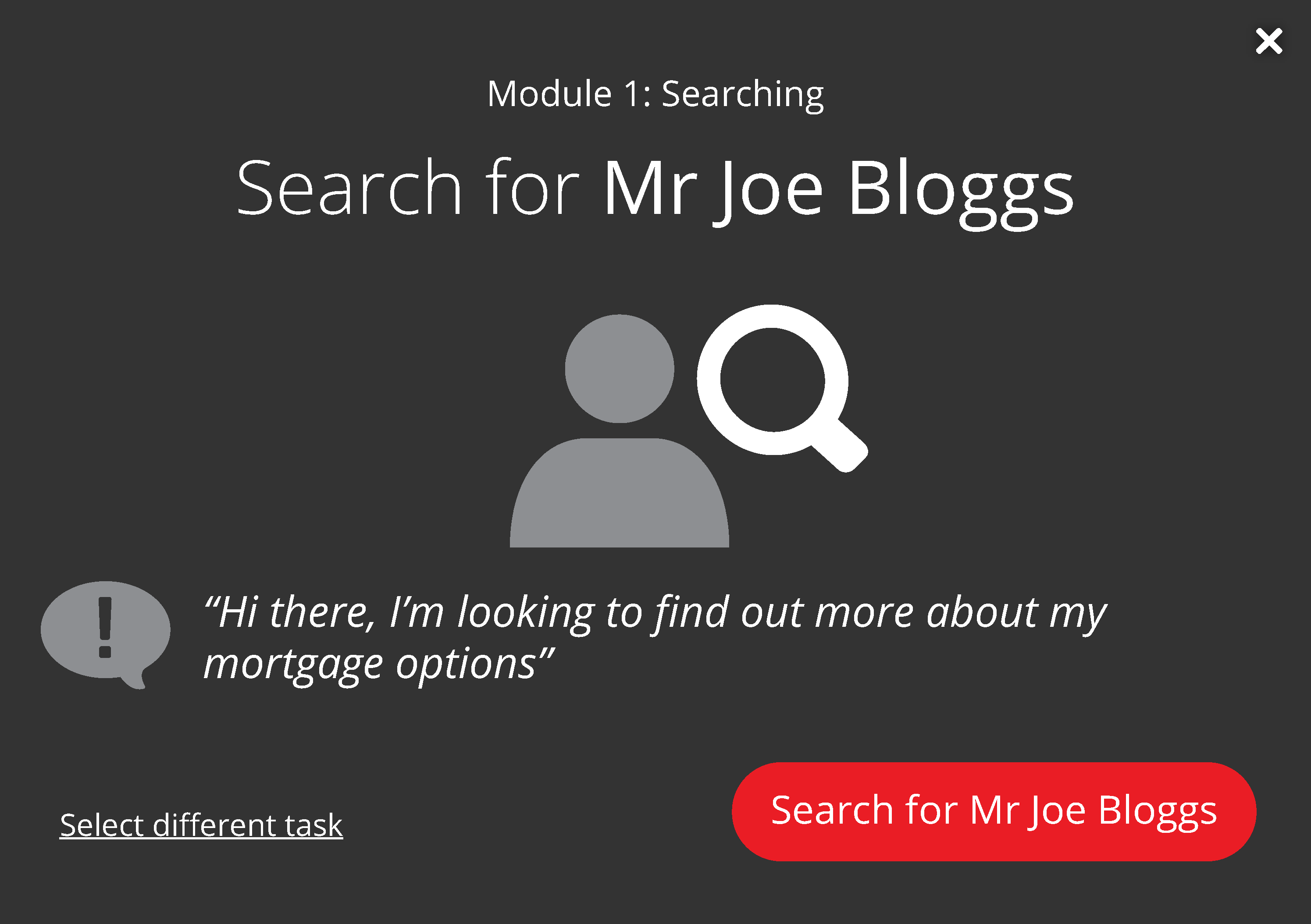
Starting a task (i.e. playing the game)
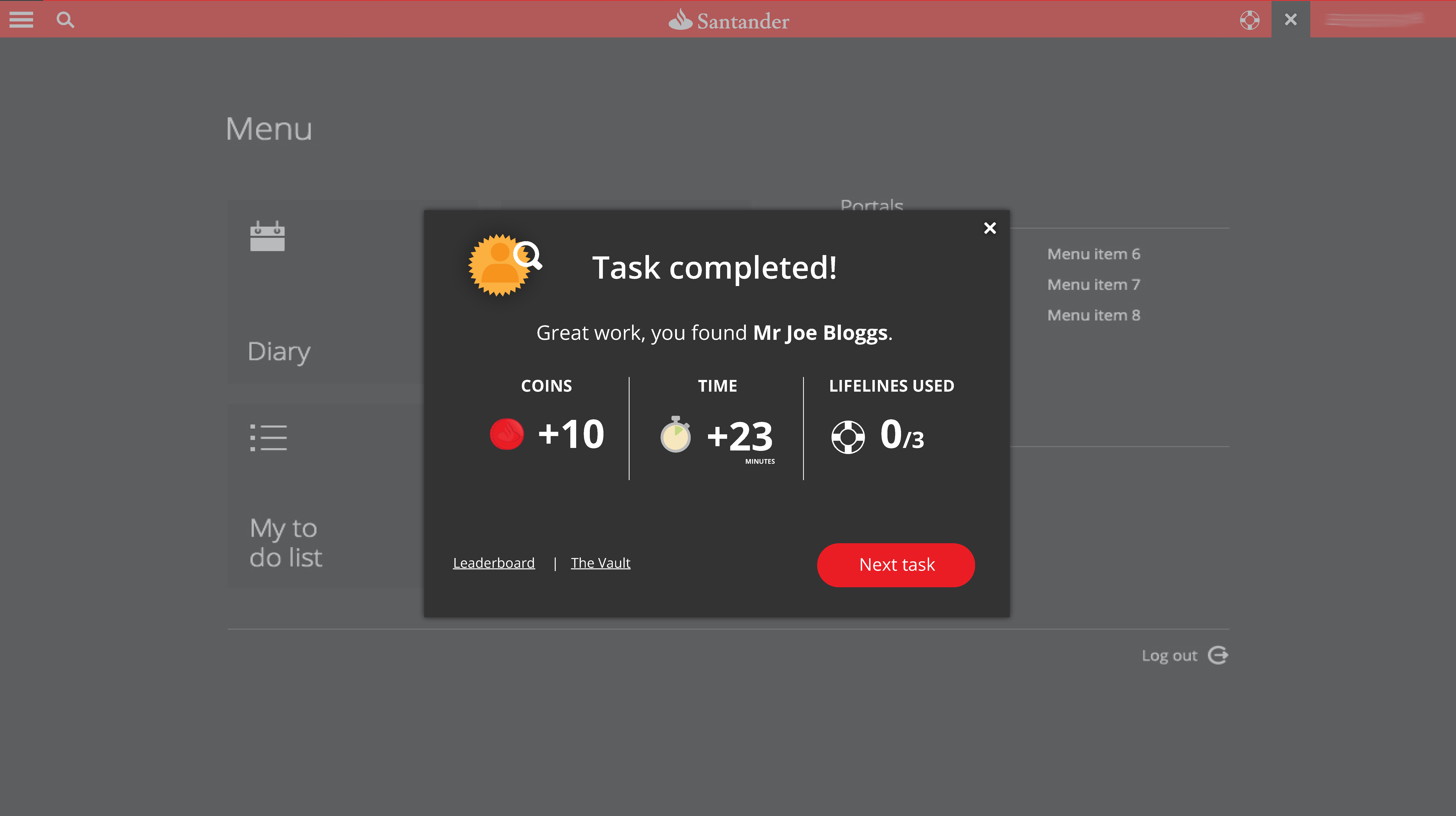
For each task, an introduction modal would appear to explain the task. The aim was to demonstrate the actual usecase in the form of a customer request. In order to offer a sense of direction and focussed attention on the task, the call-to-action also contained active language to ensure the task outcome was explicit and unambiguous.
Feedback loops
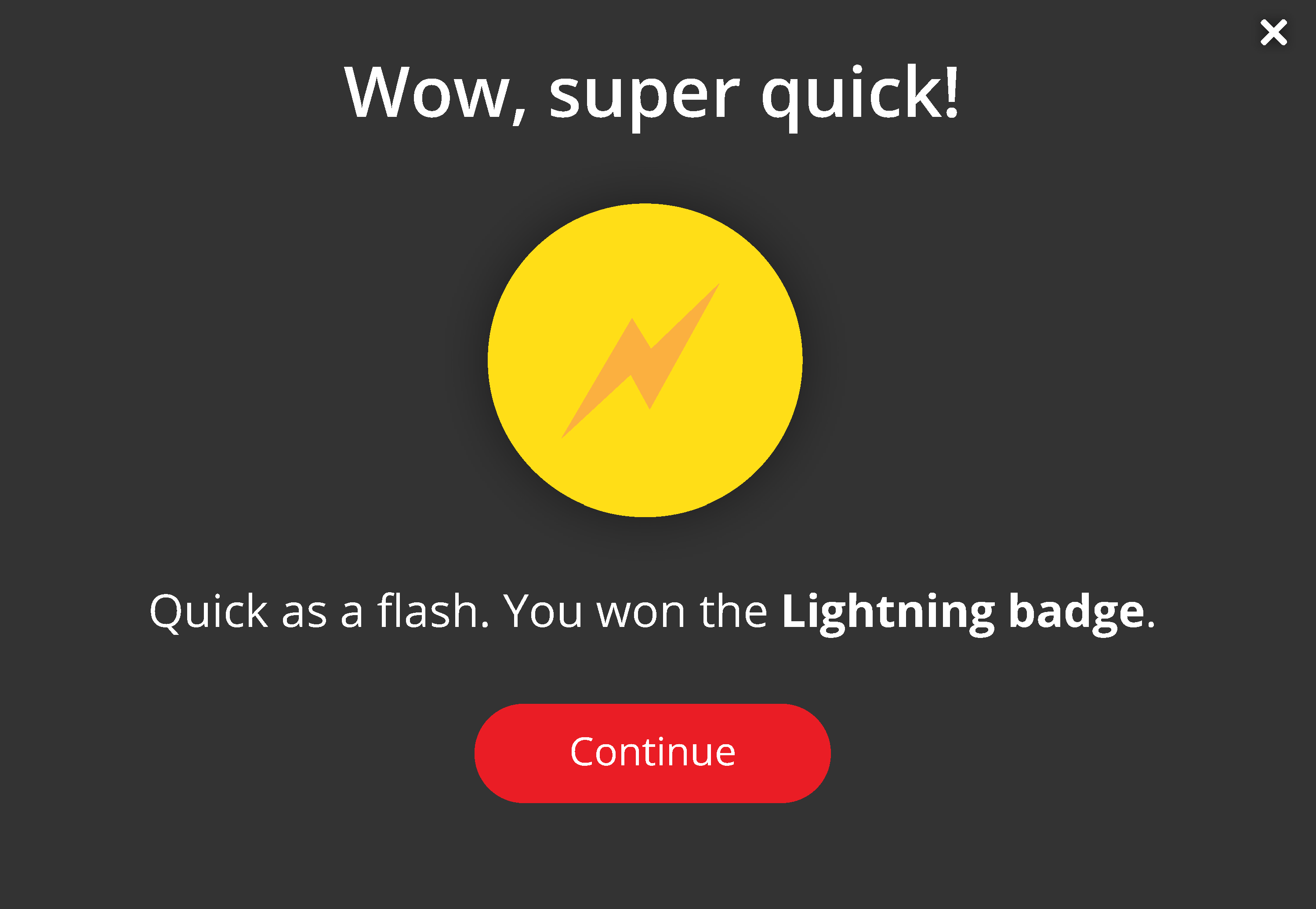
I designed a set of badges for a list of user action usecases. They were based upon perfect scores, quick times, and other achievements. Below is an example of the ‘Lightning badge’ which offered a sense of achievement, and a positive reinforcement for playing.
Task completed!
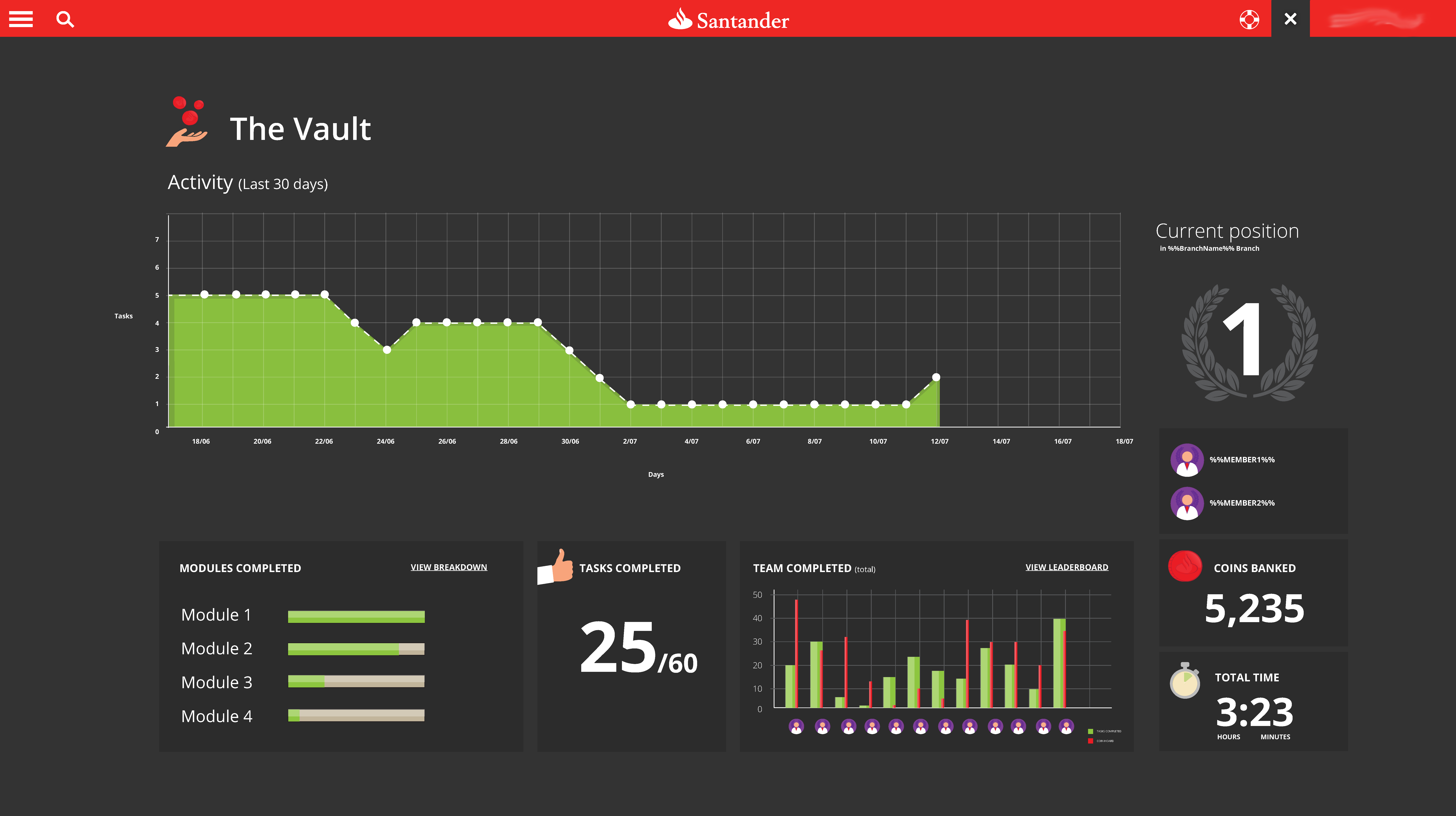
The Vault (Game dashboard)
Leaderboard
Social facilitation is one of the known drivers to achievement. Sportsmen tend to perform far better when competing directly against other athletes than in a time-trial scenario. With this in mind, I designed a leaderboard to offer a ranking of players according to tasks.
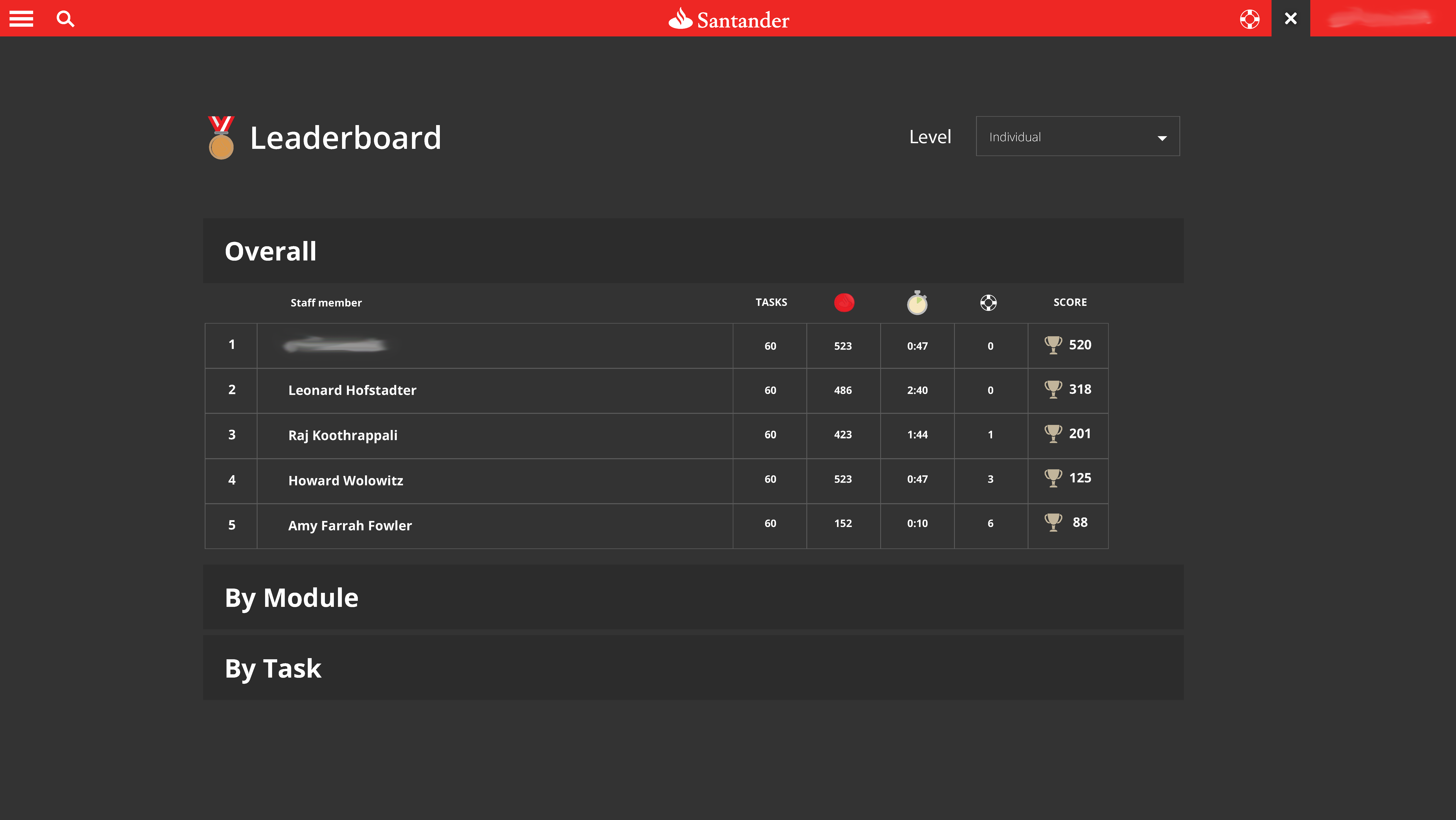
It was also possible for the user to view their own best achievements, ranked in terms of coins, number of tasks performed, time, and lifelines. The overall score was calculated to take into account latency and use of lifelines.
Penalising exploration was avoided, because when free action is penalised, it creates an inhibition to explore. Exploration was central to the project, and therefore we avoided anything which might inhibit that natural behaviour.

 I feel this is the best and most interactive training course I have completed in my 16 years at Santander!!
 What a fantastic way to help us understand the new system. I feel I have learnt more and it was fun to complete. It also motivated my team with some friendly competition.