Background
Customer Service in one of the UK’s largest consumer Banks had demonstrated itself to be a costly business. Tens of thousands of customers were contacting the Bank every day with questions and queries. These queries were all being sent to branches and call-centres around the country.
Between 2015-2016, Santander UK approached us to embark on a project to answer the question: ‘How might we improve customer access to resources?’
What we did
We were committed to delivering a digital product which brings ease and simplicity to Santander’s customers. With this in mind, I proposed a number of principles to aide in the development of a solution.
Simple
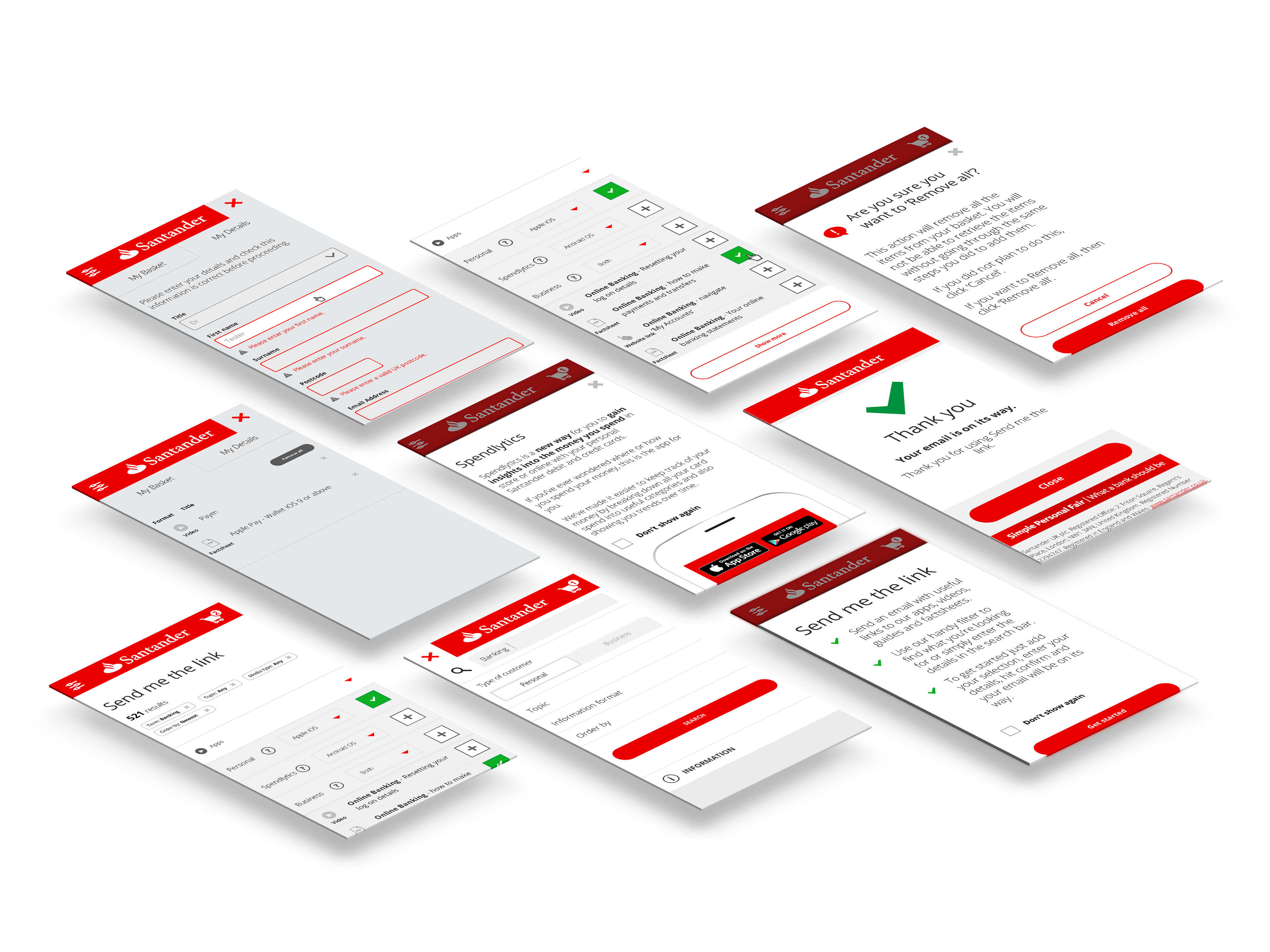
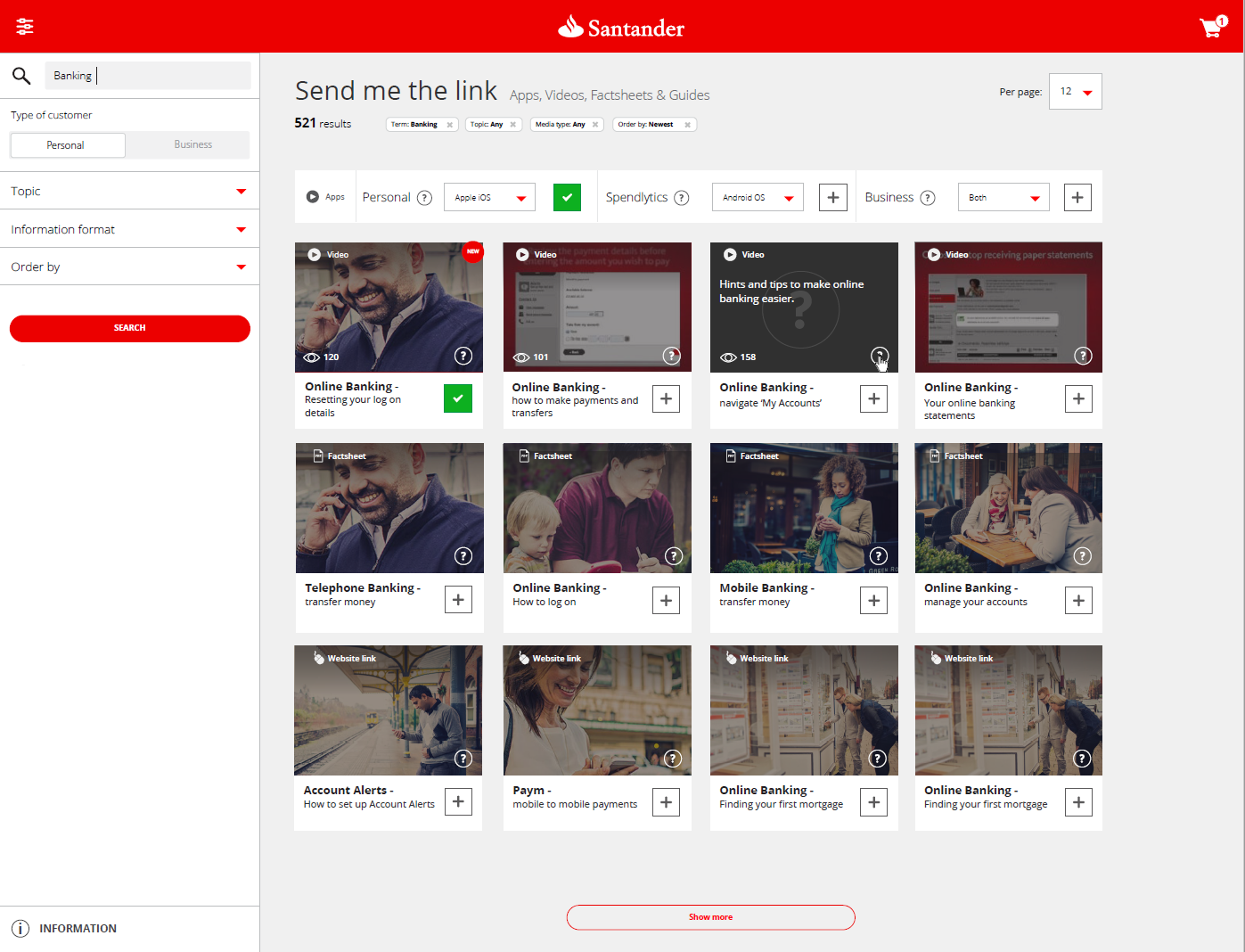
We believe the tool should clearly communicate what is available. If there are three apps on 2 platforms, then 3 apps are shown, and 2 versions of each are available. Moreover, the structure has been made as flexible as possible, to allow for future modifications. We want customers to find what they want, and to have it in an email as quickly as possible. In an ideal world, they would already have what they need, so the tool needs to be directed toward ease.
Intuitive
There is actually no such thing as universally intuitive, largely because what is intuitive is always relative to what is already experienced. So ‘intuitive’ is ostensive to something else. With this in mind, we have structured the application like a shopping basket, and made the experience akin to ecommerce. We have also brought this kind of concept into the visuals in the design, by including iconographical rather than typographical elements. A good example of this principle is using the + sign to add an item to the basket. The + symbol is a natural and universal symbol used throughout mathematics, advertising, and ecommerce.
Usability heuristics built-in
We planned the tool to be based upon Nielsen’s 10 heuristics, allowing for the status of the system to be known by the user, allowing for correction and feedback at every stage. We have also allowed all functioning items of the tool (such as filters and the basket) to always be accessible regardless of view or device. We also aimed to reduce and simplify the steps involved in the process to build a more sophisticated product.
Aesthetically-pleasing
We have used a layout which represents the dynamic brand of Santander, whilst adhering close to clean and modern design sensibilities.
Research conducted by Santander, in both Focus Groups and Statistical Analysis suggest that the Bank’s primary audience for the tool had a strong propensity to retail shopping. Despite fact, this group tended to need assistence with digital media, and have low confidence in its use.
With this in mind, I created a schema for conversion which mirrored a purchasing paradigm.
Filtering & Sorting
The process therefore replicated a design pattern in which the user could sort and filter prospective options using categorisations. The user could also use a verbatim search box to reduce the number of results.
Browsing for help
The majority of requests to the call-centres were on the basis of seeking support for particular products, or seeking resources relating to the mobile banking apps. Selecting items added them to the basket.
Conversion
Proceeding to ‘convert’ through the process was done using a ‘tunneling’ UI pattern, which removed a much distracting content as follows. The user was allowed to review their options or return back to finding other sources before completing their ‘order’.
Post ‘purchase’
Completing their order meant that the user could select their method of delivery, either by SMS or email. A specific template, which I also built, was used to deliver assets using HTML email.


Key results
The platform is currently still active, and has been running for a number of years. The system hosts hundreds of assets across three different format types.
On average, the tool assists over 12,000 users every month.
To date, the system has enabled almost 1 million app downloads, driving the customer adoption of Santander’s mobile banking apps.