Background
The role of digital identity in the global economy was increasingly being discussed internally at the business. The means of leveraging the resources of the business, as well as looking to fix existing issues within employee onboarding was very high. The business invested in development of an Identity Platform.
The business considered the most direct way to reach this market was by building an employee identity validation system, in the form of a Background checking platform. After significant amounts of initial desk research, I established a preliminary ‘why’ statement (starting with Why):
Trust is the basis for business. Let’s build the trust economy.
And with a matching product strategy to begin with drawing on existing competencies and network relationships…
To create a frictionless on-boarding platform for employment pre-screening
My role
As the only Product Manager in the business, I naturally took a central and leading role on the project. I coordinated much of the process, and liaised with many people across the business to establish the product.
Discovery (Understanding the problem)
Statistics around the cost and liabilities of employing people without checking their background appropriately were significant. Many of the business’ clients had first-hand experience of these challenges, and so the need to resolve these challenges better was high on the agenda.
User interviews
I interviewed a number of HR professionals from administrator to Head of titles. I explored their Jobs to be done, their biggest anxieties and their wishes and desires to improve existing processes. Based upon these learnings, I consolidated into a number of User Personas, including both Recruitment and HR roles. One of the most interesting quotes were:
…I feel like I was born before all this technology, because I’d rather speak to people, than use a computer…
I wish I could just click a button, and all the info I need would be just ‘there’
Realising that this was only one side of the story, I also interviewed a number of candidates too. I was particularly interested in the most complex cases, such as where someone had a lot of gap activities or had traveled. These caused the most issues using existing systems. Some of the verbatim learnings were:
I submit my details, but then I don’t hear anything. Sometimes I have to chase for myself because I haven’t heard what’s going on.
When I’m asked for information, it ends up being via loads of emails and I end up losing track.
Ethnography
I also attended conferences and a number of CIPD events in order to meet and speak to HR professionals in an environment in which they felt comfortable. In these spaces, I also listened to the presentations and featured talks as a means to understanding what it means to work in HR. The events allowed me to get a real sense of empathy for the challenges facing the modern HR professional.
Competitor analysis
Alongside all these activities, I also took a detailed look at competitors. This was a combination of both desk research, and direct research by means of getting demos of competiting products. These insights allowed me to reconcile the views of the people I interviewed with the feature-sets already present within the market.
In light of the learnings about the anxieties around the problem of ensuring staff-members had their background check correctly, I named the product ‘CheckSafe’, and so using the Brand naming convention, it became known as EQ CheckSafe.
Based upon the lessons from speaking to HR professionals, I was able to define a set of generalised characteristics which embued the people I had spoken to, and allowed them to be adopted as the personality of the product:
- To be rational and fair, professional, but not impersonal
- Emotionally intelligent, and sensitive to user needs
- Be liberal in approach, recognising that everyone deserves to be treated according to their own needs
- Prioritise a good experience
- A belief in transparency and fairness for all
User Stories & Product Roadmap
In order to begin the process for the Software Engineering team, I translated the problems into statements of their Jobs to be done. These User Stories allowed the Engineering team to begin to find solutions for them.
Branding
Based upon research within the business, I knew that much of the market perceived it as a corporate entity. With this in mind, and having spoken to many HR professionals, I recognised a conflict between the wider Brand and it’s audience. With this in mind, I sought to brief the design team on an execution which reduced the corporate mask, and increased the sense of simplicity and friendliness. This decision wasn’t made without criticism, but I defended it by using examples of what HR professionals had said, and by testing the conceptual illustrations with actual HR professionals.


A designer in my team was a very talented illustrator, who prepared a friendly and open icon set to reflect the values of the product to its target audience. As mentioned, this was also crucial to overcome the PLC’s corporate mask which was necessary for adoption by this audience.
Product Roadmap / Milestones
A full timeline for product development, defintions of done and acceptance criteria for testing solutions against the user stories were also created. I have redacted this detail here though, being mindful of confidentiality.
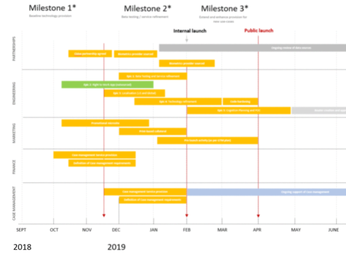
This image has been blurred for privacy reasons.
Wireframes and Prototypes
Working with a colleague, we attempted to translate the challenges of the HR and Candidates into a set of screens. Firstly we brainstormed using the ‘Crazy 8’s’ format. Then we moved onwards to drawing out on a whiteboard, and talking through in detail how our decisions lead to positive outcomes for the user personas. We iterated a number of times.
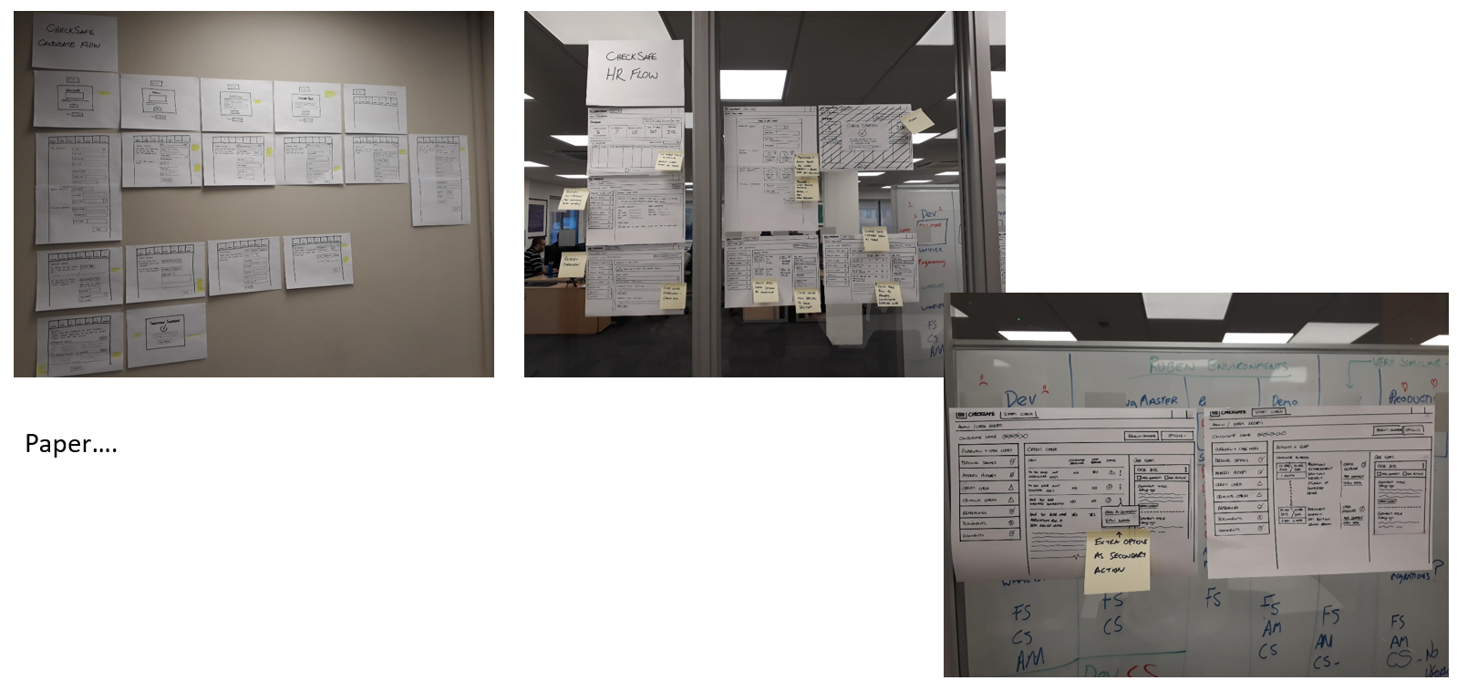
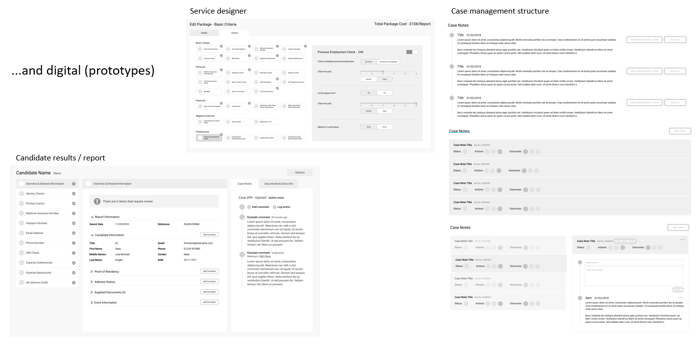
Once the core system flow had been worked out, my colleague set about refining and presenting as paper prototypes to support the product development. Once we felt comfortable with these layout decisions, we proceeded to create digital versions to test the interactions and flow as close to the final outcome as possible.
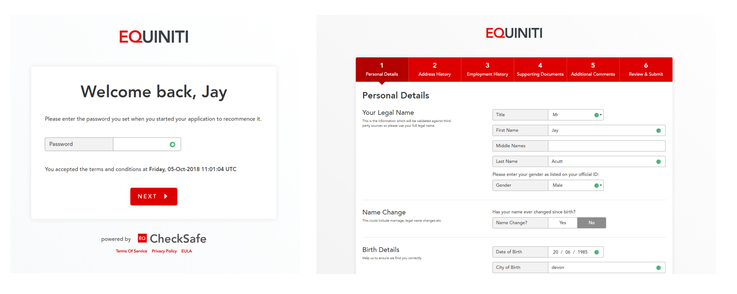
Final UI Designs

Supporting collateral and Copywriting
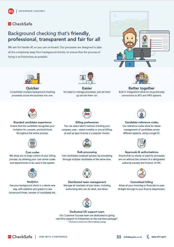
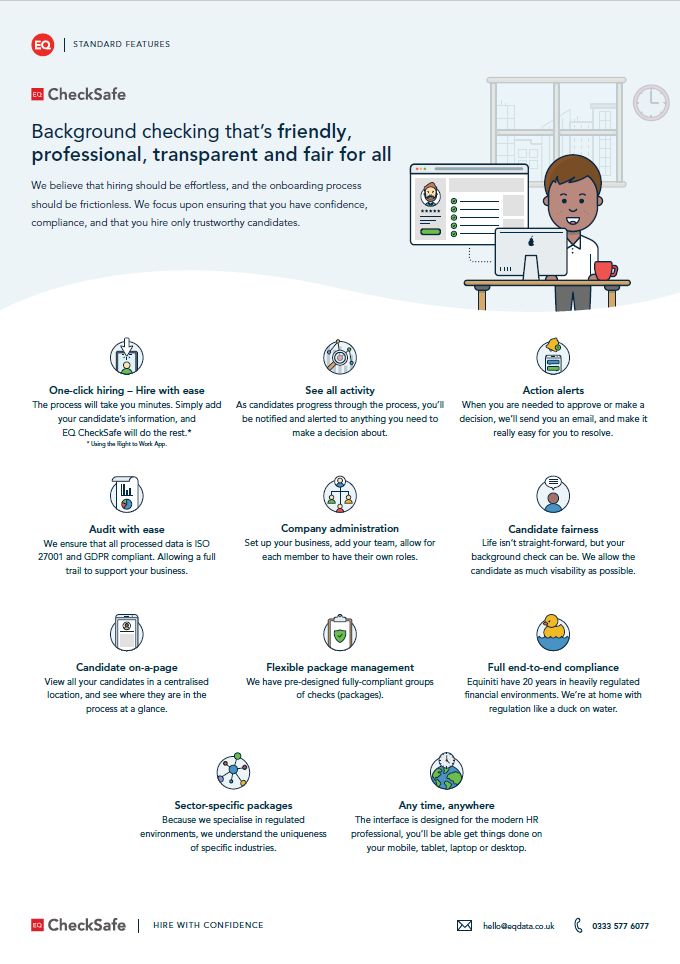
Once I entered into the Marketing and UX Design role, I also oversaw the Branding and Content writing more directly. I wrote all the content for the website and all showcase material. I also wrote a script for a promotional video, but this has yet to be made.
Some of the 1-pager content is shown below:


Go-to-market Plan
Once the product was on it’s way for delivery, with clearly outline milestones (see the Roadmap above), it was now time to transition to marketing and promotion.
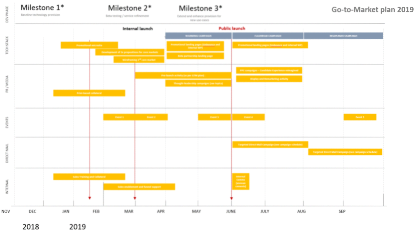
This image has been blurred for privacy reasons.
I wrote a Marketing Plan for this product, to align well with Customer Development both within the wider Group and externally. This meant that the product release was based upon the customer relationships we already had, and the use of advertising and promotion based upon our learning from Beta Partners.

