Email Design System

How might we make high quality, delightful (maybe even remarkable) emails easier, in a repeatable and pain-free way?

As Founder in

2024

for Self-motivated

Mission

Email is a medium embedded in good customer experiences. It’s ubiquitous, inexpensive for businesses, and everyone knows how to use it. It’s an excellent way for customers to stay informed, and use it as a filing system for their purchases, receipts, offers, and personal communications.

I’ve worked with a number of businesses that didn’t have templates for email. Their approach to the channel was an after-thought. I wanted to build an Email Design System that allowed it to be part of an existing Design System. An approach that encouraged email to be a fore-thought, and a channel to be embraced.

It’s the 21st century, and yet (from a 10 minute random scroll through my current inbox) emails feel like they haven’t changed much for decades. This framework is an attempt to make high quality, delightful (maybe even remarkable) emails easier, in a repeatable and pain-free way.

Moreover, email can be a quite remarkable channel. It has the credibility of a letter, but also the speed and ease of many other digital channels. I’ve been struck by the number of professional environments I’ve been in where the creative capabilities of email weren’t even known, let alone harnessed. This Email Design System is designed to change that.

Prerequisites

Before you get started, you should assess whether this is a framework that will work for you. In order to hit-the-ground running, you’ll need:

  • Basic understanding of HTML and CSS,
  • A program to edit (I like Adobe Dreamweaver, because I can see a live render of the email whilst building, and also like to use Chrome’s DevTools),
  • A method of sending/distribution (Email Service Provider, or ESP),
  • A commitment to great email, even if it requires some minimal effort.

Caveat emptor:

Although every effort has been made to test this framework in various viewports, devices, user agents, ESPs, there’s always a chance that you’ll encounter issues. 

From experience, I’ve built and tested email on a Friday, with it rendering fine, only to find by testing again on Monday that it’s render had changed on an ESP. Unfortunately this is the nature of email. Always test before distribution. Even so, the codebase here should always get you 95%+ of the way forward.

Always check the open rate and viewing analytics for your own user-base. If you find that an outsized dominant segment is opening on Outlook on desktop,then it’s unlikely that they’ll see the interactive widget enhancements. The templates will still function beautifully though. If your user-base is primarily iOS mail, on iPhone, then your customers will enjoy all the benefits of this framework, and the widgets. Just ensure the effort is worth it for your specific customers. 

The Framework

This framework is built using 3 elements that have been rigorously tested: a grid system, a widget system and a theme system. Let’s dive in to learn more about them:

Grid and layout system

The grid is a modular, row-based structure. 

Boilerplate grid template

An email built using this framework consists of rows of tables. All emails are built from tables because email uses an earlier version of html as a baseline, one that predates the ‘div’. Every row is a discrete and encapsulated piece of code. This provides the advantage for adding widgets and quick troubleshooting by identifying where an issue occurs. Over the years, I’ve seen many approaches to building emails, even some that use a single table and hundreds of ‘rowspan’ attributes. This leads to a messy and complicated structure, that makes everything dependent on everything else: if one thing fails to render, then everything will fail to render. The alternative is encapsulation and modulation.  

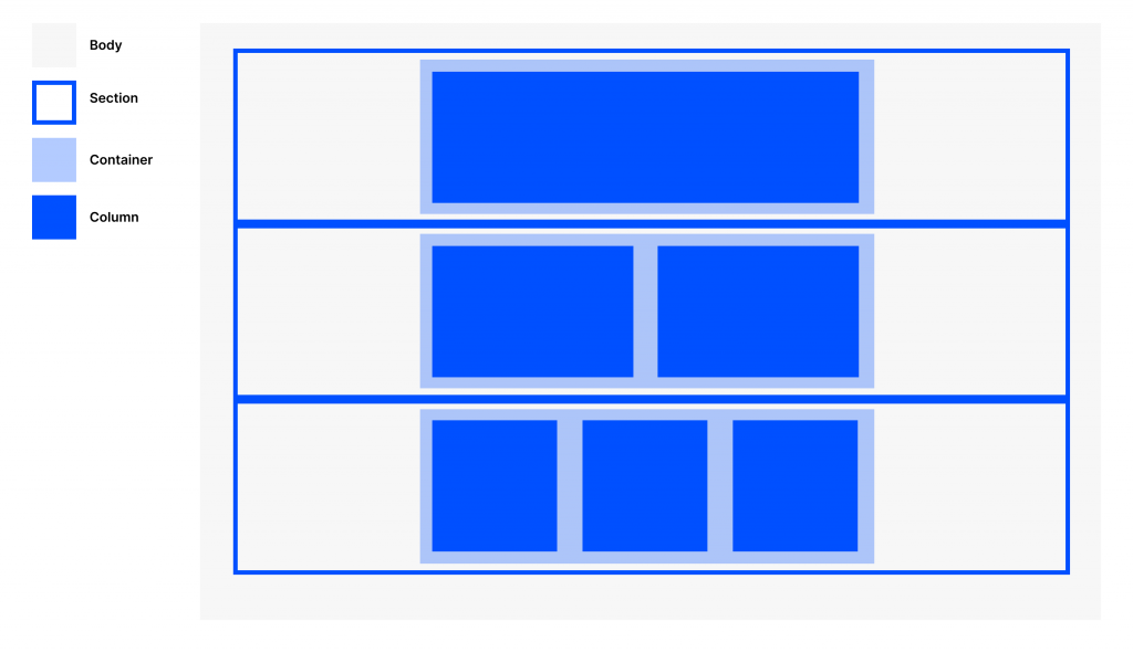
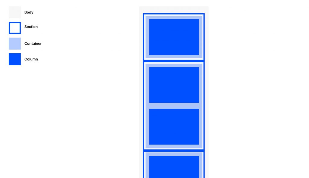
According to this framework, each email is split into 4 parts: Body, Row, Container, Column. Each one is nested within another. 

Body: represents the entire visible html document, following the html specification. Within the Body, the content is split into rows called sections. 

Section: every row is a ‘section’, following the html5 definition. A section is a table that is set to 100%. It will always be the full-width of the viewport. An original specification of this framework used the designation ‘row’, but because of the way some widgets are built, this was not an accurate naming convention. Having every component built into a ‘section’ allows for easier trouble-shooting, cleaner code, and cosmetic benefits such as sections with different coloured backgrounds. Within every section is a container. 

Container: A constrained wrapper to contain all the content. Set to a default of 640px on desktop. On a mobile device, this will shrink to 320px. The container is the main wrapper for all content, and is the primary way that responsivity is produced. This can easily be changed or adapted to new breakpoints by changing the value of the container. This means, to update default values, you need only update a single variable. Within every container is a set of tables called columns.

Column: the role of the column is to produce the vertical grid system. Based upon the column idea introduced in Bootstrap. The desktop default function is single column. In a mobile device, a column will always spread to fill 100% of the container width. The column table is set to 640px width. This will be a 1-col layout. 2 columns each split into 320px will produce a 2-col layout on desktop. 3 columns each split into 160px will create a 3-col layout. Regardless of desktop layout, all the above will produce a single column layout on mobile. In order to change this, there are special suffixed container classes: column-50, column-33 etc define the mobile column width. 


Using this simple nested structure, it’s possible to produce any possible layout and responsive behaviour. 

Widget system

Some use the term ‘Partials’ (Litmus), some use the term ‘Components’ (Campaign Monitor), whereas this system uses ‘Widgets’. 

Every widget consists of a CSS component and an HTML component. Every widget in this framework is self-contained, meaning that you can add the code without fear of affecting something else in the email. There are few dependencies outside the grid system, and So you can add all components on the same email, or pick-and-choose – all with the confidence that nothing will break. 

The total list of widgets (so far) compatible with the framework is:

  1. Burger menu
  2. Accordion
  3. Tabs
  4. Responsive hero / Jumbotron
  5. Web Fonts
  6. Carousel
  7. Email rating
  8. Responsive video
  9. Cinemagraph
  10. Tap & Twist

There is a test result guide for performance and progressive enhancement for every widget.

Each widget is progressively enhanced. The mobile experience in iOS is the highest quality possible. The code then gracefully degrades to allow a clean and beautiful experience in other ESPs. 

To demonstrate how they can all work together, the all-widgets.html shows the all-in version of an email that exploits all the widgets in a single email.

Theming & styling system

The ability to update primary, secondary, tertiary colours, as well as background styles is made easier using a few intentionally placed classes. 

Because inlined styles are also important in email, you will also need to find/replace the hex codes in the email. All colours are unique to the class of primary/secondary/tertiary, so you won’t break anything by doing a clean find-replace for these 3 colour classes. 

Examples of creative styles and themes will be forthcoming, and they remain on the backlog until available.

Minification

Minifying the code is a great final step to reduce file size and load time. If you use an online minifyer, don’t forget to check your company’s restrictions for third-party tooling first. 

Using the Email Design System

To get started is super easy, and fast. Start with the base template, grid.html. This code allows you to start from the core foundation of the structure, similar to the way Bootstrap is designed to offer the utilities and structure to get going quickly. 

If you want to start from something a little more sophisticated, then you could start from the all-in.html template. This template proves how all components play nicely together. 

To add or remove a widget, simply copy and paste the code for the CSS between the start and end comments into <style></style> tags. Likewise, add the html row to the <body></body> wherever you want it to show. 

Change all the images from the placeholders and update all visible content from the Carl Sagan Ipsum I used in the default template. 

Upload the source code into your favourite email broadcasting tool, and send some tests. Correct as needed. 

How was the framework tested? 

Testing methodology 

Round 1: The framework has been tested in live and native environments, meaning I was lucky enough to have access to testing devices, and set up all my ESP accounts on my own devices. This was the first round of testing.

Round 2: the second round was to prove stability via scale. This was via emulation tooling such as EmailOnAcid and Litmus. Testing results are provided for each widget. I appreciate all feedback and corrections to ensure the code is stable.

Roadmap / backlog

I’m working on making improvements to this framework, just for my personal use. The following roadmap represents where it will go next:

Upcoming new features

I’m still working on this framework, and there are many more widgets and options I intend to create. Here’s a list of the items on my backlog: 

  1. New widgets:
    1. Hotspot
    2. Cinemagraph
    3. CSS Carousel
  2. Theme repo: inclusive of corporate, tech, agency themes. 
  3. Messaging repo: an end-to-end example of email messaging following content design best practices. These are designed to speed up your time-to-broadcast. Further examples are available on reallygoodemails.com. 

Known bugs

  • There’s a known issue with Outlook mail on iOS.

Acknowledgements and credits

The framework was built on the shoulders of giants, who each contributed their own important leaps forward over the last 20 years.

Feedback and get in touch

If you find a bug, or have suggestions for new features, or if you just want to get in touch and share your own approaches, alternatives or explorations – I’d love to hear from you!

  1. ‘Bug bashing’: by using the facilities on Github. Standard rules apply: the context of the issue (where it was seen, what’s the code that was used, which ESP etc) which will allow further deep-dive to fix appropriately. 
  2. Let’s talk: you can reach me via my website: https://jamieacutt.com/contact. You’ll be able to shoot me a message directly using the webform. 

Reuse Licence

The framework is released under Creative Commons Attribution licence

You can change it, update it, even sell it. Go forth and give the world great emails!

The only thing that’s expected is that a small reference to me and this repository would be given as a thank you for making it available to anyone. “Built with the Ascendable framework” is acceptable, and similar (for example) to one you might use on a website too.