The Framework
This framework is built using 3 elements that have been rigorously tested: a grid system, a widget system and a theme system. Let’s dive in to learn more about them:
Grid and layout system
The grid is a modular, row-based structure.
Boilerplate grid template
An email built using this framework consists of rows of tables. All emails are built from tables because email uses an earlier version of html as a baseline, one that predates the ‘div’. Every row is a discrete and encapsulated piece of code. This provides the advantage for adding widgets and quick troubleshooting by identifying where an issue occurs. Over the years, I’ve seen many approaches to building emails, even some that use a single table and hundreds of ‘rowspan’ attributes. This leads to a messy and complicated structure, that makes everything dependent on everything else: if one thing fails to render, then everything will fail to render. The alternative is encapsulation and modulation.
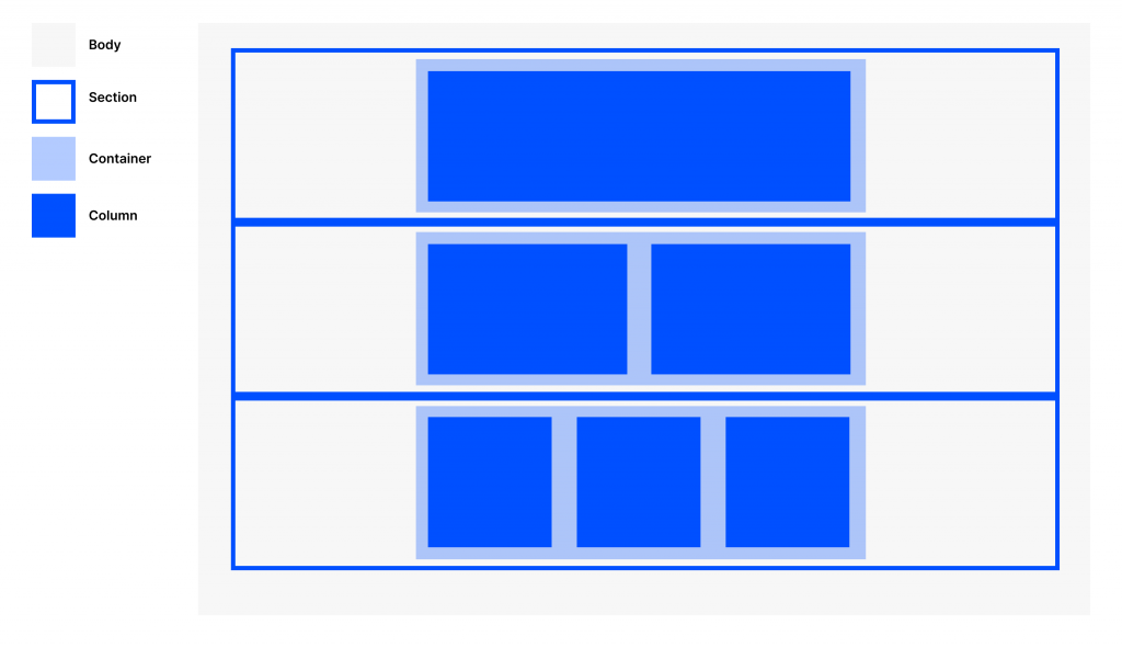
According to this framework, each email is split into 4 parts: Body, Row, Container, Column. Each one is nested within another.
Body: represents the entire visible html document, following the html specification. Within the Body, the content is split into rows called sections.
Section: every row is a ‘section’, following the html5 definition. A section is a table that is set to 100%. It will always be the full-width of the viewport. An original specification of this framework used the designation ‘row’, but because of the way some widgets are built, this was not an accurate naming convention. Having every component built into a ‘section’ allows for easier trouble-shooting, cleaner code, and cosmetic benefits such as sections with different coloured backgrounds. Within every section is a container.
Container: A constrained wrapper to contain all the content. Set to a default of 640px on desktop. On a mobile device, this will shrink to 320px. The container is the main wrapper for all content, and is the primary way that responsivity is produced. This can easily be changed or adapted to new breakpoints by changing the value of the container. This means, to update default values, you need only update a single variable. Within every container is a set of tables called columns.
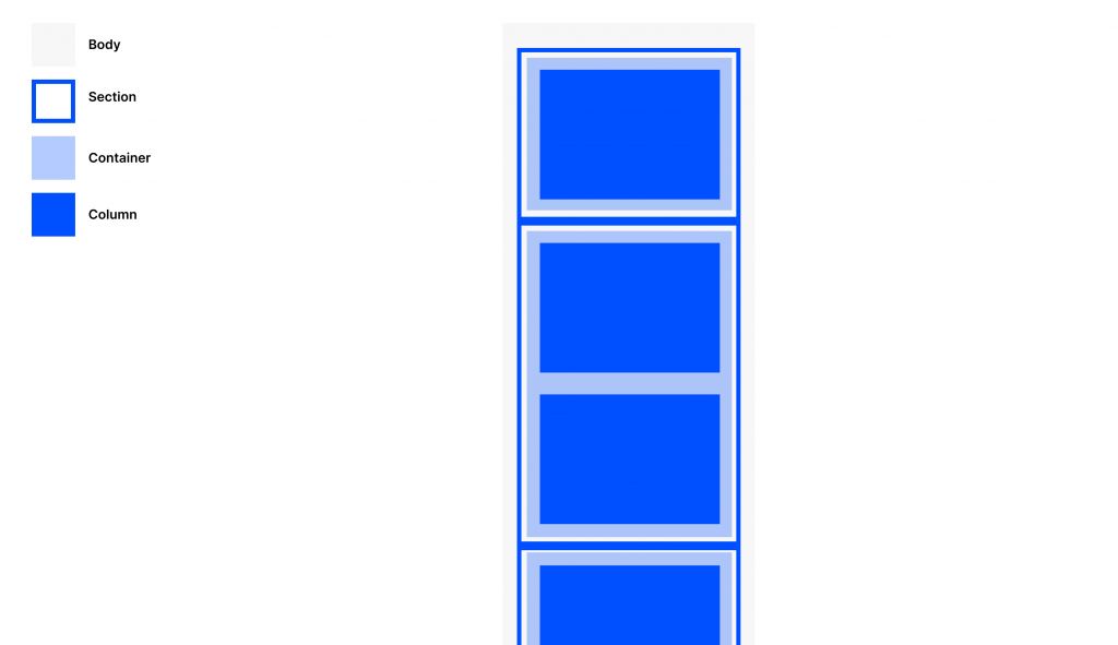
Column: the role of the column is to produce the vertical grid system. Based upon the column idea introduced in Bootstrap. The desktop default function is single column. In a mobile device, a column will always spread to fill 100% of the container width. The column table is set to 640px width. This will be a 1-col layout. 2 columns each split into 320px will produce a 2-col layout on desktop. 3 columns each split into 160px will create a 3-col layout. Regardless of desktop layout, all the above will produce a single column layout on mobile. In order to change this, there are special suffixed container classes: column-50, column-33 etc define the mobile column width.


Using this simple nested structure, it’s possible to produce any possible layout and responsive behaviour.
Widget system
Some use the term ‘Partials’ (Litmus), some use the term ‘Components’ (Campaign Monitor), whereas this system uses ‘Widgets’.
Every widget consists of a CSS component and an HTML component. Every widget in this framework is self-contained, meaning that you can add the code without fear of affecting something else in the email. There are few dependencies outside the grid system, and So you can add all components on the same email, or pick-and-choose – all with the confidence that nothing will break.
The total list of widgets (so far) compatible with the framework is:
- Burger menu
- Accordion
- Tabs
- Responsive hero / Jumbotron
- Web Fonts
- Carousel
- Email rating
- Responsive video
- Cinemagraph
- Tap & Twist
There is a test result guide for performance and progressive enhancement for every widget.
Each widget is progressively enhanced. The mobile experience in iOS is the highest quality possible. The code then gracefully degrades to allow a clean and beautiful experience in other ESPs.
To demonstrate how they can all work together, the all-widgets.html shows the all-in version of an email that exploits all the widgets in a single email.
Theming & styling system
The ability to update primary, secondary, tertiary colours, as well as background styles is made easier using a few intentionally placed classes.
Because inlined styles are also important in email, you will also need to find/replace the hex codes in the email. All colours are unique to the class of primary/secondary/tertiary, so you won’t break anything by doing a clean find-replace for these 3 colour classes.
Examples of creative styles and themes will be forthcoming, and they remain on the backlog until available.
Minification
Minifying the code is a great final step to reduce file size and load time. If you use an online minifyer, don’t forget to check your company’s restrictions for third-party tooling first.


